9/21/23
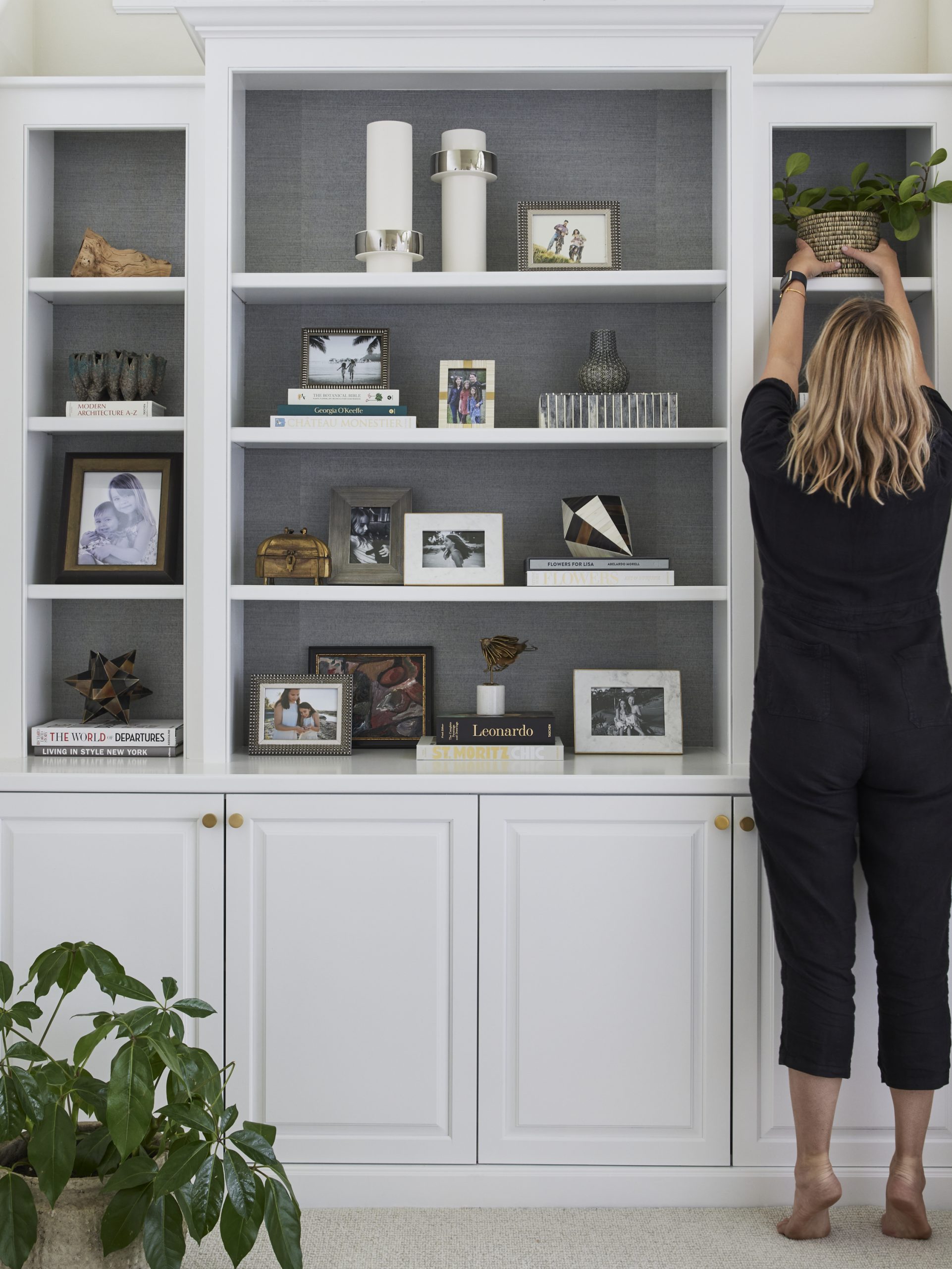
Ah those notorious bookshelves. Too often, people have no idea what to do with them, and it shows. They can look unbalanced or too bare, and that can detract from what is an otherwise amazing room. That’s where pros like the Pulp team come in. We take care of every single detail in the interiors we design, and we know how to leave our clients with wow-worthy and magazine-ready rooms. So here are our 5 pro tips for styling your bookshelves so they look polished and perfect!
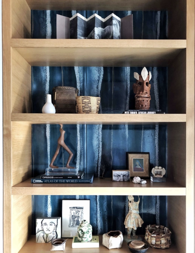
1. Back It Up
Don’t forget the background of your shelves. You can create a stunning showcase for your mementoes and books by using wallpaper or paint to set them apart. Having color or pattern peek through between the items on your shelves makes them more visually interesting. You can see that in our Seattle Glass House project above, with that lovely blue wallpaper from Phillip Jeffries.
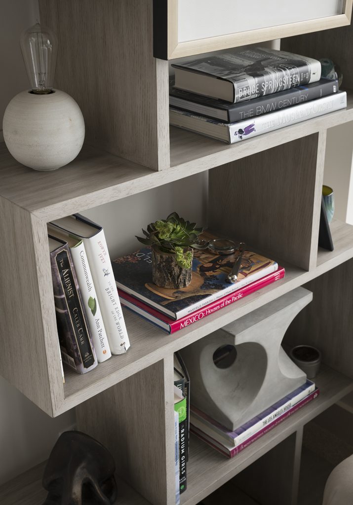
2. Vertical / Horizontal
Bookshelves should allow your eye to travel, to move from element to element. One of the best ways to do that is to offer both vertical and horizontal elements. Even if your shelves are mostly filled with books, it’s best to stack some and then prop others. It also offers a balance to each open space, allowing you to fill in the open area or to let some air breathe around it. And one thing to remember is that you will never get this right the first time. You’ll need to take things down, move them around, and keep placing them until you get that balanced look!
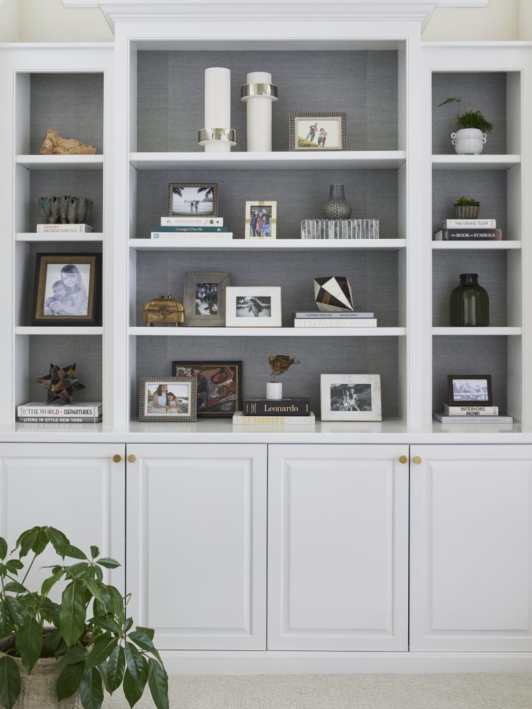
3. The Magic Number
Until you feel more confident, one easy trick is to remember the power of three. Three elements will help you achieve that balanced look. It could be a stack of three books, three framed pieces of art, or three items on one shelf. Try it – it works almost every single time!
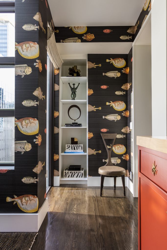
4. Show Personality
Pulp believes in the element of surprise, and there’s no better way to showcase that on your bookshelves than with quirky or personal items. They may be things you’ve brought back from travels, something meaningful from your childhood, or even items that you collect like pottery or art. Those pieces will give life and visual interest to your shelves and show your guests a bit of who you are.
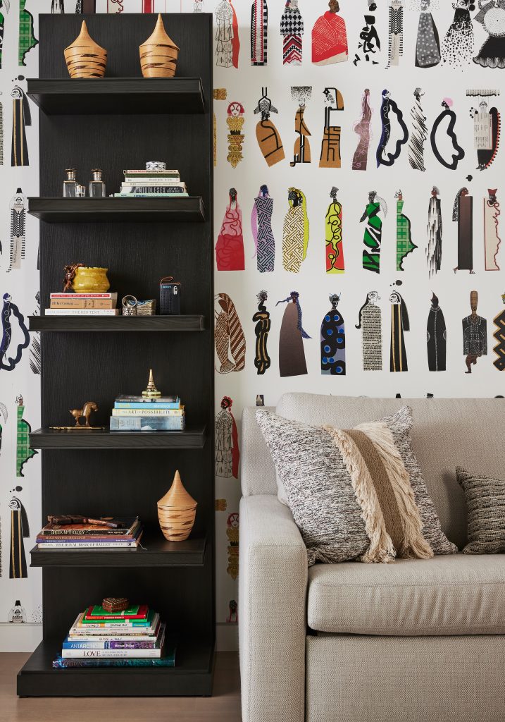
5. Layers Are Key
Using those first four tips, experiment with layering. Mix books and art, add boxes and frames, even place things in front of others. Create a storyline that visually tells the viewer something about you and your family. Keep moving things around and step back to see how it all looks as a whole. When it’s right, you’ll know it. There will be balance and a lot of visual interest!
Credits


