I love a “renovation reflection” – the time after the renovation when you find that you love things even more than you thought, realize some things are way less important, as well as your basic regrets and missed marks. So today I’m answering a bunch of questions about the kitchen that I keep getting – mostly reader and Instagram comments from the reveal which was super fun for me to just answer off the cuff.
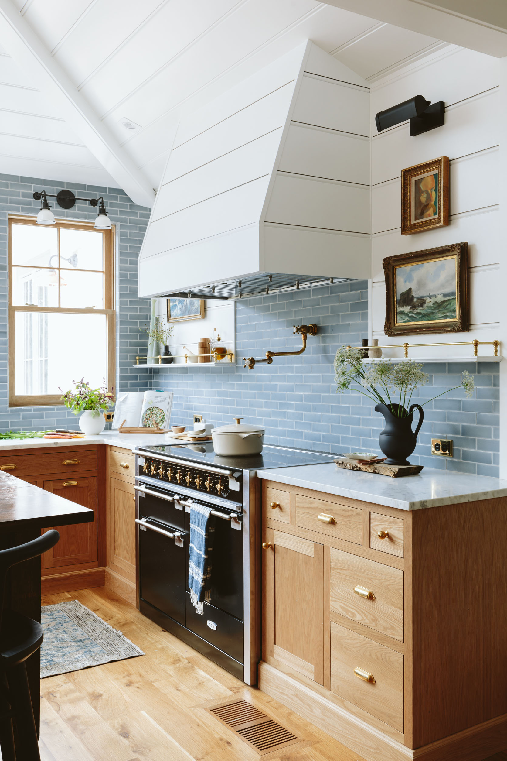
Love the oak cabinets and the marble worktop! I’m dying for a practicality update on the marble as I need to make a decision on whether or not to go with marble worktops soon – did you seal it and what with? What caused the marks you say it’s already got? Did you feel terrified sitting on it in case it scratched or does it feel robust enough for that? Have you dropped red wine/turmeric/lemon on it yet and what happens when you do? Please please could you write about that?
I 100% understand your hesitation. Real stone is prettier because it has a unique organic pattern, but it’s not for everyone (I’m currently at the mountain house and still LOVE the white matte Cambria – quartz – we chose here). How old is your house? I personally think that real marble is particularly essential in older homes (totally fine if you use quartz, too) but if you are hesitant (which it sounds like you are) and you have a post-modern *style* home (anytime after 1950s) then I’d go with a quartz or porcelain. Most designers I know (and I agree) that a lot of the veining on quartz can be incredibly fake looking. It’s just my opinion but I’m not alone. In our kitchen, with the real honed marble, we have a decent amount of etching and marks now – mostly red wine, lemon, marinara, and the ultimate culprit of the unassuming… turmeric. ALL of them fade in time, they might not totally go away but they fade. You really have to make sure your expectations are set before you do this – we KNEW this would be the case and opted in because we wanted the real stone and we are 100% glad we did. Not one day or stain goes by where I wish we didn’t have this beautiful marble on our countertops. Also, there is confirmation bias in the mix, too It adds so much authenticity to an older home, which is why I really want you to ask yourself if you NEED it in your house. For my brother’s river house home project, we are doing different quartz in different rooms (all Caesarstone) and none with the faux veining. But it’s new construction and very contemporary so we are beholden to NO style challenges – we can do whatever we want. I hope that helps!!

What is the countertop seam situation with your countertops? There’s a lot of conflicting advice out there!
Our seam is behind the faucet and we have a farmhouse apron sink so that’s the only place you see it. It doesn’t bother me at all, but I don’t hone in on details like that. When everything else is so pretty I find that your eye really ignores little things like that. I didn’t think that we would need a seam – our slab was long, but I trust our fabricators that they did what was right. The corner (by the range) doesn’t have a seam – they made it an L-shaped slab. I love that, but at the same time, they used the only part of the slab that I didn’t love (it had lots of brown in the veining which looks dirty). So I was surprised when I saw it featured so prominently (there was a huge conversation about them avoiding using that area). It doesn’t bother me too much anymore, and I’m glad there is no seam. With real stone (like real wood) you just get what you get and have to work with the organic imperfections. It’s a good trade-off for us. Oh real quick, the biggest culprit has been the “not quite fully dried” pot lid, turned over on the counter to dry without a towel (so dumb). It wasn’t dirty anymore but the lid lip can rust a bit. I’ve now left these rinsed but not dried TWICE and in the morning was a HUGE round ring, in a darker yellow color. I freaked out (both times) and they have since faded but you can totally still see them.

The cabinets look very pretty and natural. Can you share the finish they used on the cabinets? Wax or oil, etc?
Unquie Kitchen & Baths used an all-natural Linseed oil. They clean up like a dream, aren’t shiny, and didn’t add any orange.
And if anyone wants to work with them you can get a little discount (10% off) with my code: EH2022
What’s the hardest thing to keep clean/is it hard to maintain?
Truly nothing comes to mind immediately as hard to clean/maintain YET. We PAINSTAKINGLY chose everything to be easy to clean (while still choosing stone, real wood, etc). There are a few original cracks in the top of the island that we could have filled but chose not to and those get crumbs which when I’m cleaning drives me nuts. The unlacquered brass faucet and pot filler takes a specific wax that I have only used once (so we aren’t really cleaning it) but oh that patina – so pretty. The walls underneath the shoe bench thing have gotten pretty scuffed up because we just throw our shoes in there, but I think once it drives me nuts enough I’ll use a magic eraser. The induction top is SO wonderful to clean, the island surface has held up almost miraculously (besides the crumb cracks). So I guess just the stone countertops making sure that we don’t leave the usual suspects there. But we are only nine months in, so I think this will be a great question in a year or four. Wait, as far as clutter – that corner bench area is full of backpacks, shoes, coats, garbage, things being charged, etc. It’s a mess, but it’s a contained mess. I tidy it daily and it’s fine.
How often do you have to take care of your unlacquered brass faucets and how long does it take?
Ha. I have been using just water and a micro rag, but I just cleaned it with the wax for the first time and I think it’s just once a month.

I am curious that you chose not to have a toe kick for the cabinets. Any reason?
So much of this is a personal preference, but in our LA house, the little furniture-style legs got so scuffed up (but they were painted so you could see the scuff so it might have been fine here since it’s stained wood which is so much more forgiving). I think it was more to make it simple and streamlined, easier to clean, etc. But a good thing to remember which I always forget about is that you can’t put this trim under any appliances – dishwasher, fridge, and drawer fridges – and you notice it missing more in the photo below.

So I guess the answer is it was a design choice that we made at the time, but I like both. Many people have said it’s more ergonomic to be able to tuck your feet underneath the space under the counter (the toe kick) while cooking or cleaning, but it has not bothered us AT ALL. HOWEVER, by choosing this design we had to put the heat vent on the floor in the kitchen, which we didn’t realize until we moved in and Brian and I were like, “Well that’s unfortunate”‘” because crumbs/food go down there so easily.

How do you keep the kitchen runner in place??
I think because it’s so long it makes it heavy and thus doesn’t move that much? We sweep/mop on Sundays and have to roll it up but I know there are great solutions out there if yours slides around. Ours is from District Loom by the way and I LOVE it.

I’m curious as to why the outlet on the bar is placed so high.
I had to go back and look to see what you are talking about! I think these things are just standard and if you don’t catch the exact placement that’s where they’ll go. It doesn’t bother me, though (probably because they are pretty outlets covers). Maybe they wanted it to be lined up with the lightswitches and they had to be that high for a reason? The point is I trust ARCIFORM enough to know that it was likely a reason, but I’m not sure what (and again, it doesn’t bother me or didn’t until you pointed it out haha).
Where is your backsplash tile from and what color is it?
It’s a handmade tile from Pratt + Larson, made in Portland custom color P-146 (which matches my favorite Levis). It’s 100% gorgeous and I’m grateful every single day that it’s mine.

How’s it going with your stove? Still love the convection?
LOVE LOVE LOVE. The big handle on the right just popped off so I need to put it back on (I can rig it for now), but as far as cooking goes we LOVE it. So easy to clean, so fast to boil, so we are very very happy.
What is the height of your pot filler?
The spout sits 17.5″ above the stovetop but is attached to the wall roughly 6″ above that, 23.25″ from the stovetop. It’s also not centered on purpose but it could have been.
This there a name for the design style of your kitchen?
Maybe “Modern Scandinavian Farmhouse”? It feels very very very me/us, and I wouldn’t describe us as “Modern Farmhouse”. Whatever it is we love it so much. At one point we were throwing around the word “Shaker,” but I don’t think I really executed it as much as I had originally intended.

How has the vintage island been holding up and how has it been using the old drawers?
I have no idea what the refinisher from ARCIFORM (Renee) used on it to match the wood tone and have it hold up so well but it’s incredible. We abuse the heck out of it and nary a water glass ring. (He mentioned he used an older oil finish that is no longer for sale). The drawers still stick but I promise I’m not lying when I say this that it doesn’t annoy me AT ALL. We still plan on waxing them this summer because so many of you suggested that and if it were more smooth that would be nice.

Do you still love you put in so many windows?
Ok here’s what I will say – when it’s sunny out YES – we love every single window and the house just sings. But when it’s rainy for days and days and days and dark at 4:30 pm and outside you are just seeing dark glass or gloom, then I find myself gravitating into the rooms with less windows. Since the backyard has been done (and we can see green) it’s been SO MUCH better, but the months of looking out at mud were challenging and I wish I had window treatments. I don’t really have any regrets, but I think we could have nixed the window that faces east (the one next to the fridge) and put hooks there or coat/purse storage. I doubt we would have missed that window at all. We could always add a cool rod or hooks across that window but haven’t felt motivated to do it yet.
Is there anything you would have done differently now that you’ve lived with it for a while?
I just wish I had chosen a slightly warmer white paint color for the walls. When it’s sunny out this color is so pretty and bright, but when it’s not I wish it was warmer (still a white, but a lower LRV – a technical spectrum I learned from commenters – thank you :)). This is totally on me. Somedays I fantasize about changing it, but it’s a real thing (probably 3-4 days of painting and $3k at least – and that’s just for the kitchen). If it weren’t open to the living room with a shared wall color/paneling it would be an easier change. But we’d likely need to do both and it’s just so disruptive and expensive to change. But if I could snap my fingers it would be a white with a less cool undertone.
Before we go, a big question that I get over and over is how much this kitchen cost, and y’all, I don’t know but a lot. It was all wrapped into a huge renovation. It’s impossible to calculate one room, but it can be assumed that this was a high-end remodel and probably $200K at least. I’m not saying that to brag (and I don’t love putting it out there TBH) but if your kitchen remodel is feeling really expensive to you just know that you aren’t alone and renovations cost so much more now than they did six years ago.
Ok, y’all – let me know any other questions you have. Also, we might do this for the mudroom so PLEASE ask any questions and I’ll answer. If you haven’t seen the mudroom reveal go check it out and then ask some questions We’ll comb both posts for comments/questions. xx
Kitchen Resources:
Cabinetry: Unique Kitchens & Baths
Countertops: Bedrosians Tile & Stone
White Oak Windows and Doors: Sierra Pacific Windows
Skylights: Velux
Tile: Pratt + Larson
Appliances (sans Fridge and Freezer): Build with Ferguson
Fridge and Freezer: BlueStar
Flooring: Zena Forest Products(Oregon grown and milled)
Lighting, Switches, Outlets, and Sink: Rejuvenation
Wall Color: Sherwin Williams, “Extra White” .
Faucets: deVOL Kitchens
Vintage Island: Aurora Mills
Counter Stools: Fernweh Woodworking
Rug – District Loom
Brass Gallery Rods: Pepe and Carols
*Design by Emily Henderson and ARCIFORM
*Photos by Kaitlin Green


