Good evening on this sublime fall day in Boston.
I know I’ve already written twice about the ugly buildings in Boston, beginning with the tragedy of the West End. But, I haven’t gotten into some of the other ugliest buildings in Boston. I’ve been working on this post for weeks, but I want to do these blights on humanity and their well-earned justice.
To be clear, I am not talking about modern buildings such as steel and glass skyscrapers.
I am talking about buildings largely made of concrete, poorly planned, oddly shaped, foreboding, cold, and just plain depressing. In addition, many are completely out of sync with their surrounding areas. That one aspect alone is quite perplexing.
The other day, we looked at three such buildings.
- Boston’s City Hall with its desert-in-the-middle-of-Boston-never-ending-sea-of-brick-7-acre-plaza.
- The Lindemann building, AKA: The Department of Mental Health (designed to make people crazy)
- The Hurley Building – Another government building
The buildings were completed 61 years ago and, in addition to being phenomenally ugly, are crumbling, stained, poorly insulated, and difficult to navigate.
While many in Boston wished to tear them down and begin anew, another faction dedicated to “historic preservation” as well as to the legacy of their architect, Paul Rudolph (in the case of the government service center, not city hall)
But first, a wonderful article concerning the advocacy of the government services center. One issue was that the complex was never completed, and Rudolph’s vision became wildly distorted.
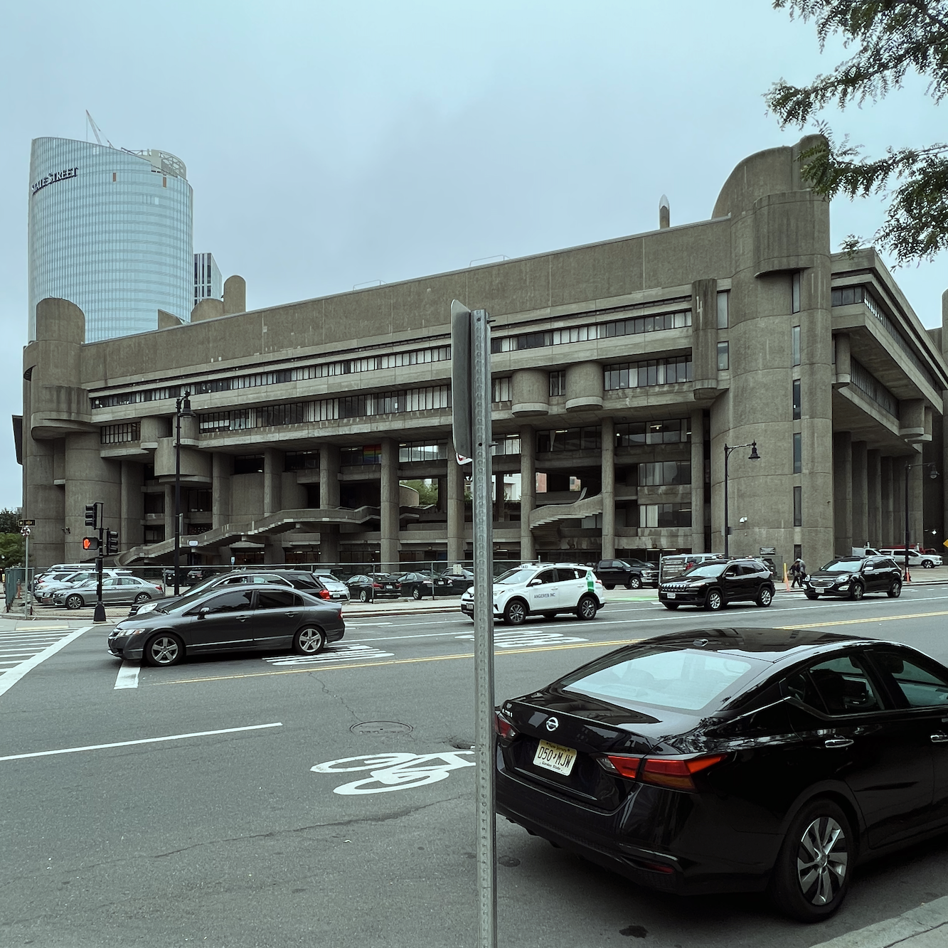
Ya think?
The fantastic article below shows renderings of the proposed building and public courtyard. Incidentally, the green space is largely used for parking.
However, how did architecture evolve so folks thought it was a good idea?
The buildings already spoken of are a subset of the late modern period known as brutalism.
While there are many well-known and revered architects of the modern period, such as Frank Lloyd Wright, Mies Van Der Rohe, and Walter Gropius, there is one who had the most influence overall.

His name is Charles-Édouard Jeanneret-Gris.
Oh, you’ve never heard of him?
Or, maybe the name sounds vaguely familiar. Jeanneret was born in 1887 in Switzerland and studied architecture in college. However, he dropped out long before graduating. Subsequently, he began working in the field. And then, without a license, he opened up his own office.
Still in his 20s, he changed his name to Le Corbusier.
He fell in with the right people and then created many villas for the ultra-wealthy and made a name for himself in the field of architecture. He was also a writer and furniture designer.
While Le Corbusier’s early architecture looked far more normal, some quite elegant, by the 50s, it had turned to concrete brutalism. He was the one who began this fad in the post-war period of the 1950s.
Interestingly, brutalism does not mean “brutal,” although it certainly should.
The term concrete brutalism comes from the French words beton brute – or raw concrete, in English.
Le Corbusier’s philosophy was to be “honest to the materials.”
They were to be left in their natural state and not treated or refined in any way. In addition, he believed there should be no artifice, no decoration whatsoever. Thus, his impersonal buildings were more like dwellings for a human-sized colony of ants.
It was well-known that Le Corbusier loved roads but hated streets. Streets were too social and unnecessary, he believed.
He disdained New York and, even more so, Paris, where he had delusional dreams of leveling dozens of acres of prime Parisian real estate in Paris’ charming Marais arrondissement.
Fortunately, that farce never happened. But others did.
With Le Corbusier’s adoration of reinforced concrete, he paved the way (pun intended) for dozens of other architects, such as Paul Rudolph, architect of Boston’s Government Service Center, to construct some of the ugliest buildings of the 20th century.
It has been said by many in recent years that Le Corbusier had high-functioning autism.
As the mother of a son with HFA, I will not disagree based on his behavior and rigid atypical thinking. He did not seem to understand people’s individuality; he treated others as objects, not as humans with emotions and unique characteristics.
The problem, it appears, is that Le Corbusier, who loved nature, did not understand its principles.
While he insisted that nature was based on geometric forms such as cubes and spheres, nature is based on fractals, geometric shapes repeating each other in smaller and smaller sizes. This is the basis for all organisms, not, as he believed, a giant rigid cube.
I mean, what in nature looks like that? The golden mean and the Fibonacci code of numbers exemplify how fractals work. There is a reason that classical architecture is pleasing to the eye. It is based on fractals and the golden mean.
Classical architecture is based on nature, as it is, not as someone who likely had a debilitating mental disorder imagined it to be.
Brutalistic architecture is the antithesis of nature. It is barren and soulless. It connotates death, not life, and well-being. This is why it makes most of us so uncomfortable. These buildings are hostile and cold; as I said, they’re giant bullies.
So, just how many Brutalist buildings are there in Boston? I was shocked to learn that there are dozens. There’s a map that you can purchase here.
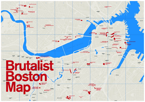
The one for sale is much larger and legible.
However, I noticed on the map there’s one in Back Bay. If you look at the map, Back Bay is the area just under the widest part of the river and in the middle of the map. Please look at the location and notice it is close to the Boston Public Garden.
As soon as I saw the word “church,” the image of this grotesqueness came flooding back like a tidal wave at the time of a full moon.
You see, I’ve walked past this horridness dozens of times since moving to Boston. It is on the corner of charming Marlborough and Berkley, the cross street, only a 3-minute walk to the public garden and Beacon Hill.
Let’s take a look.
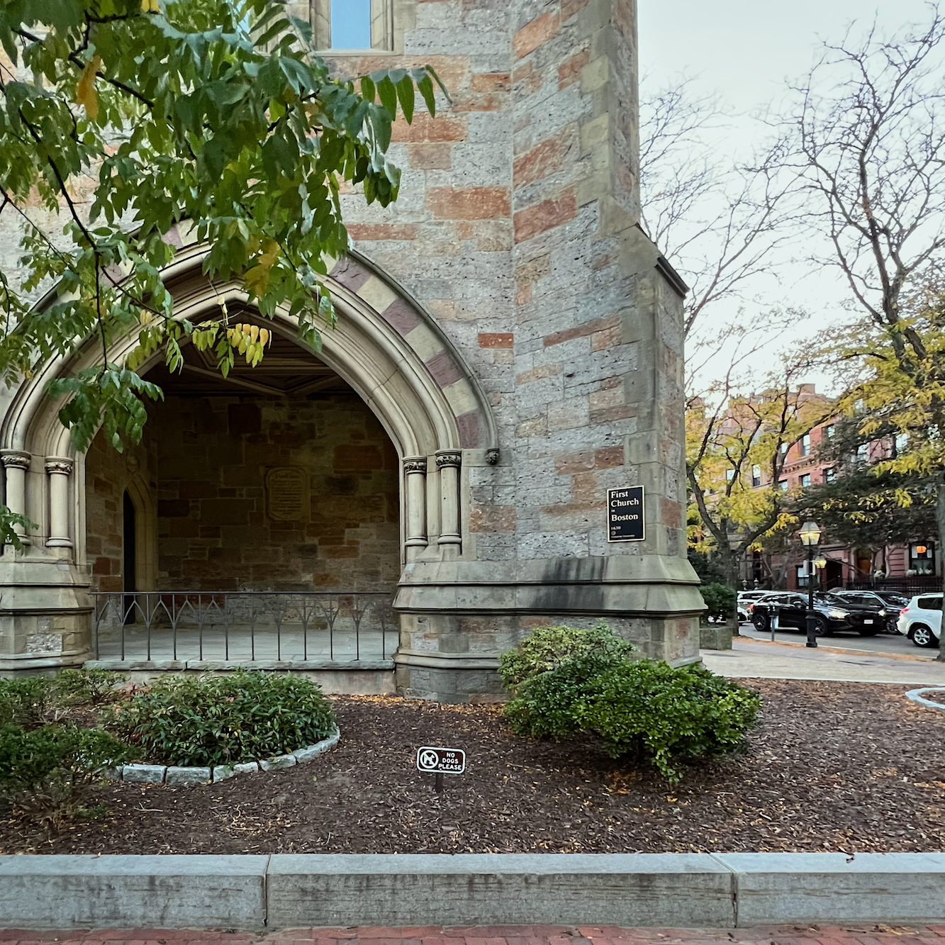
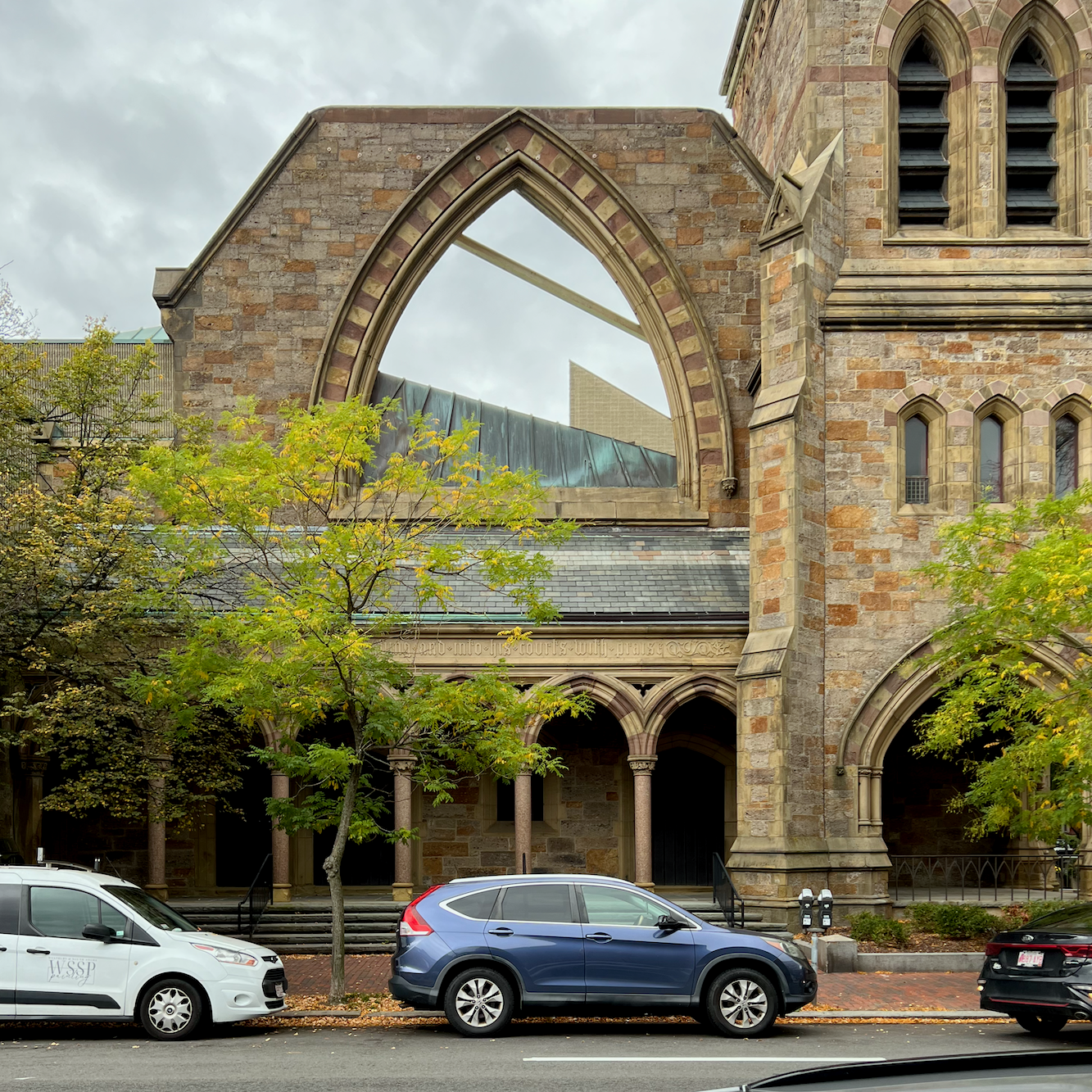
What are you talking about, Laurel? That looks like a lovely stone church. Is it kind of Gothic in style?
It was kind of Gothic in style, located in downtown Boston, and built in the early 19th century. However, by the 1860s, the population had shifted, and the building was moved to its current location in Back Bay. They moved buildings a lot in those days.
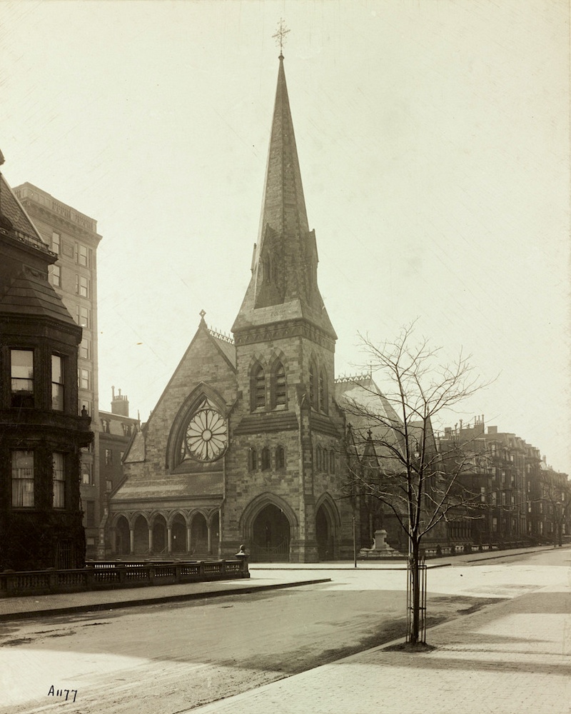
Here’s a photo taken around the turn of the century in its current location on the corner of Berkley and Marlborough.
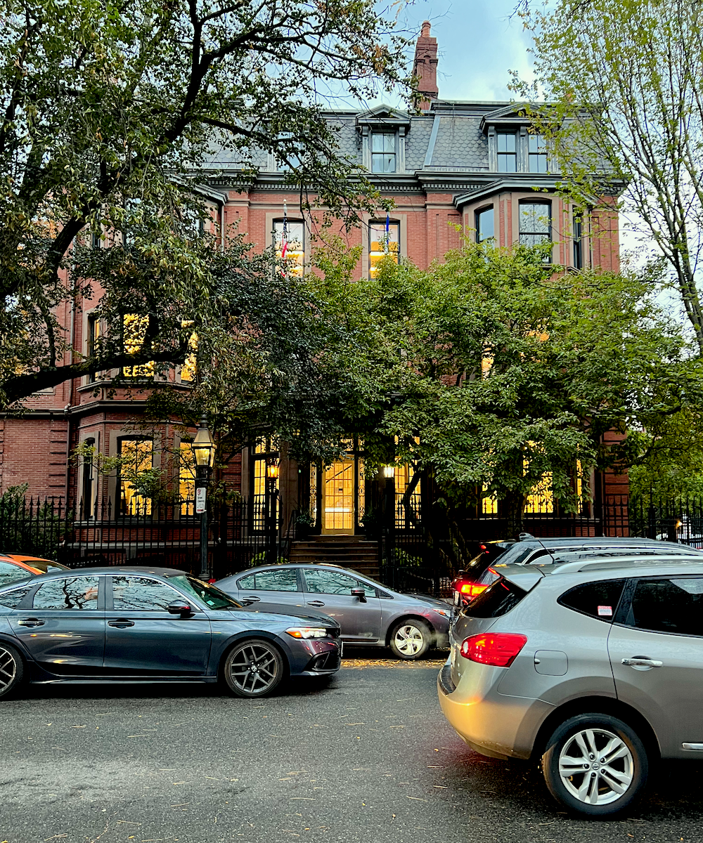
This is the building across Marlborough Street from the first Church.
However, you must realize by now that this Church no longer looks like this. Well, let’s say that 90% doesn’t look like this.
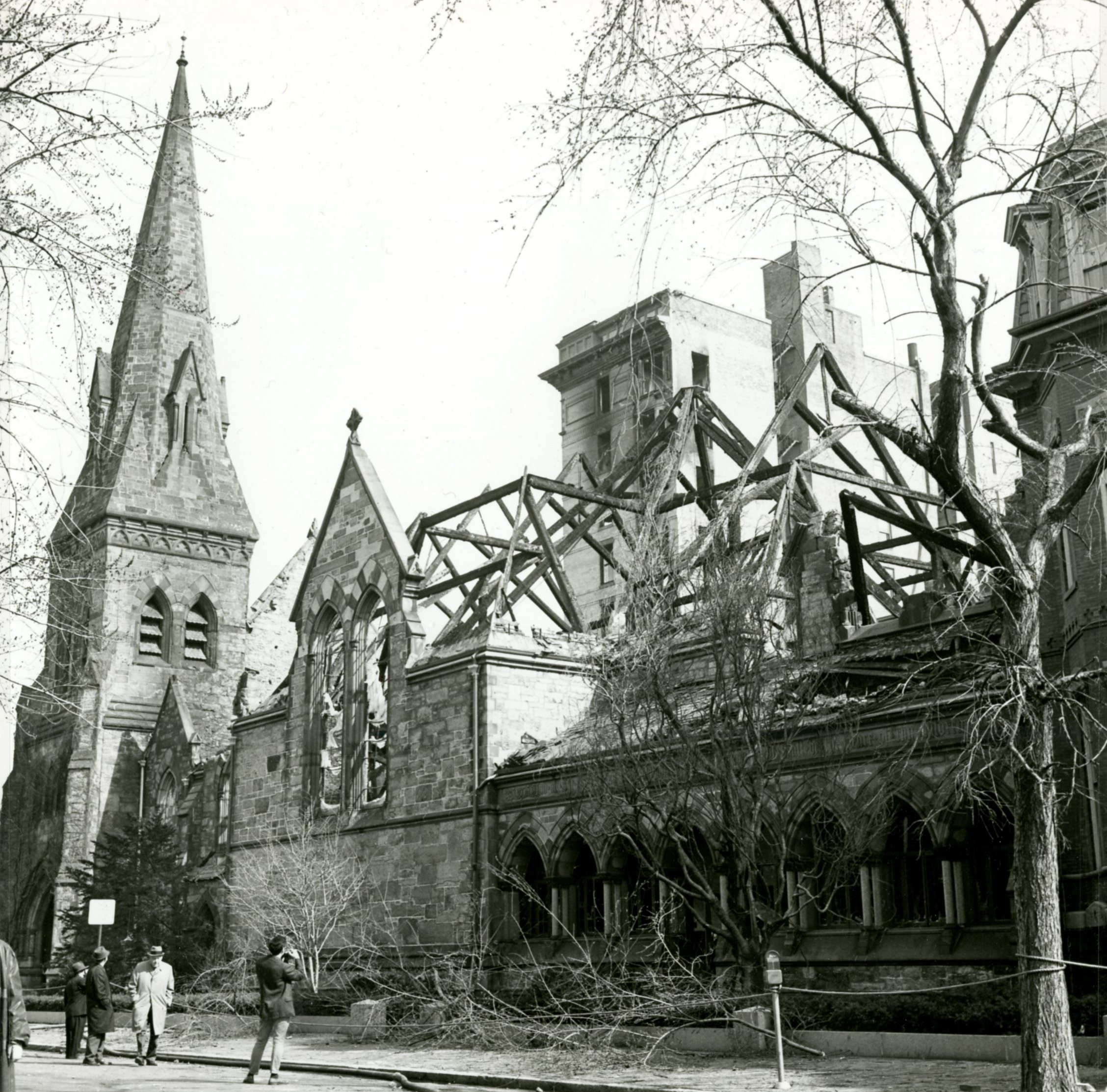
Tragically, in 1968, there was a devastating fire that gutted the place. Of course, the Church was still needed. Soooo, guess who they hired to do the rebuild?
The same guy who designed this. (below)
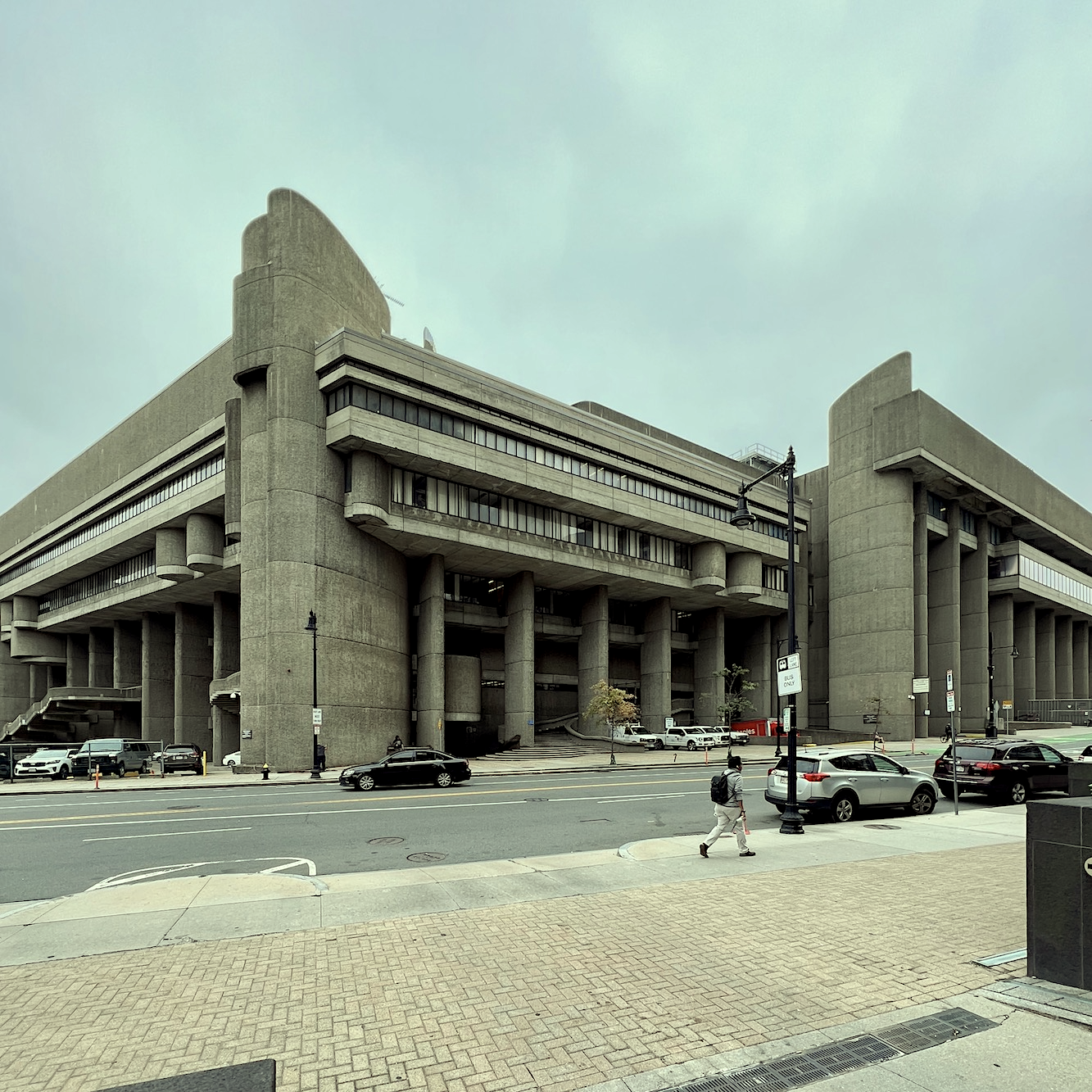
Yes! The Erich Lindemann Department of Insane Architecture.
How can that be? Well, the Lindemann building was finished slightly before the Church. I dunno. It was the late 60s, early 70s. Please use your imagination. :]
I imagine they wanted a modern church for a modern era.
It was beginning to happen on Beacon Street. While the Back Bay Architectural Commission had been formed in 1966, it wasn’t fully on top of things until the mid-1970s.
Would this architecture have passed the committee’s stringent standards today?
NO FREAKING WAY!!!
Well, can we see what it looks like now?
Yes, of course. But, before I do, like the Lindemann building, the finished product has little resemblance to Rudolph’s drawings. You can see them here via the Paul Rudolph Institute.
So, let’s look at what the Church looks like in October 2023. Mind you, they are doing some construction. However, the crane fits right in!
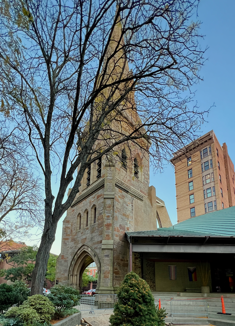
I’m bringing you in slowly. If you scroll back up, the facade you’re looking at after the fire was largely intact. They could’ve preserved so much more of the exterior.
However, they didn’t.
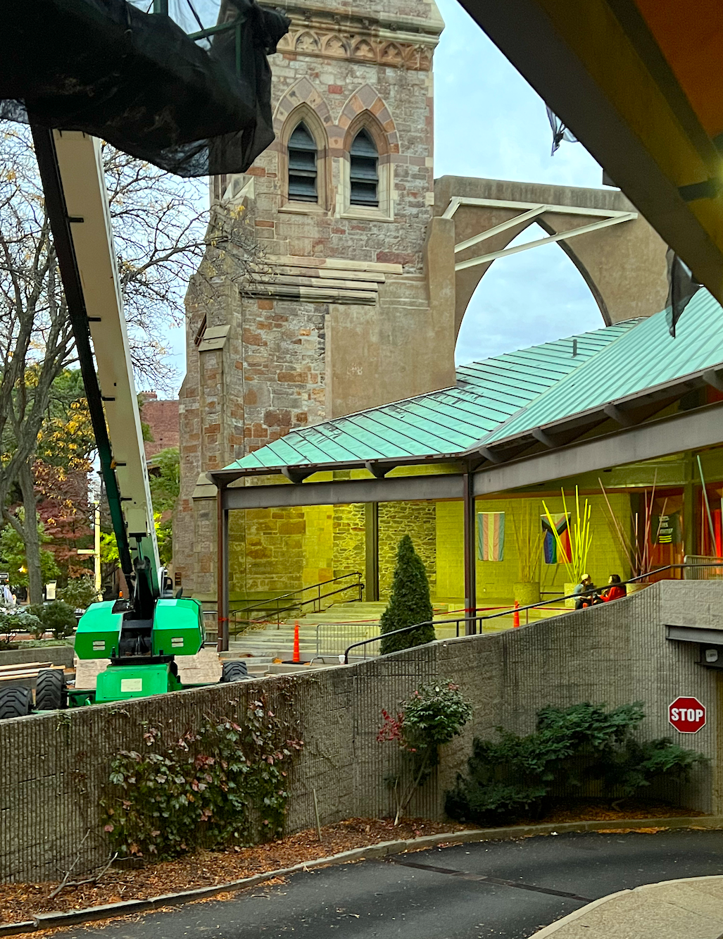
STOP is right!
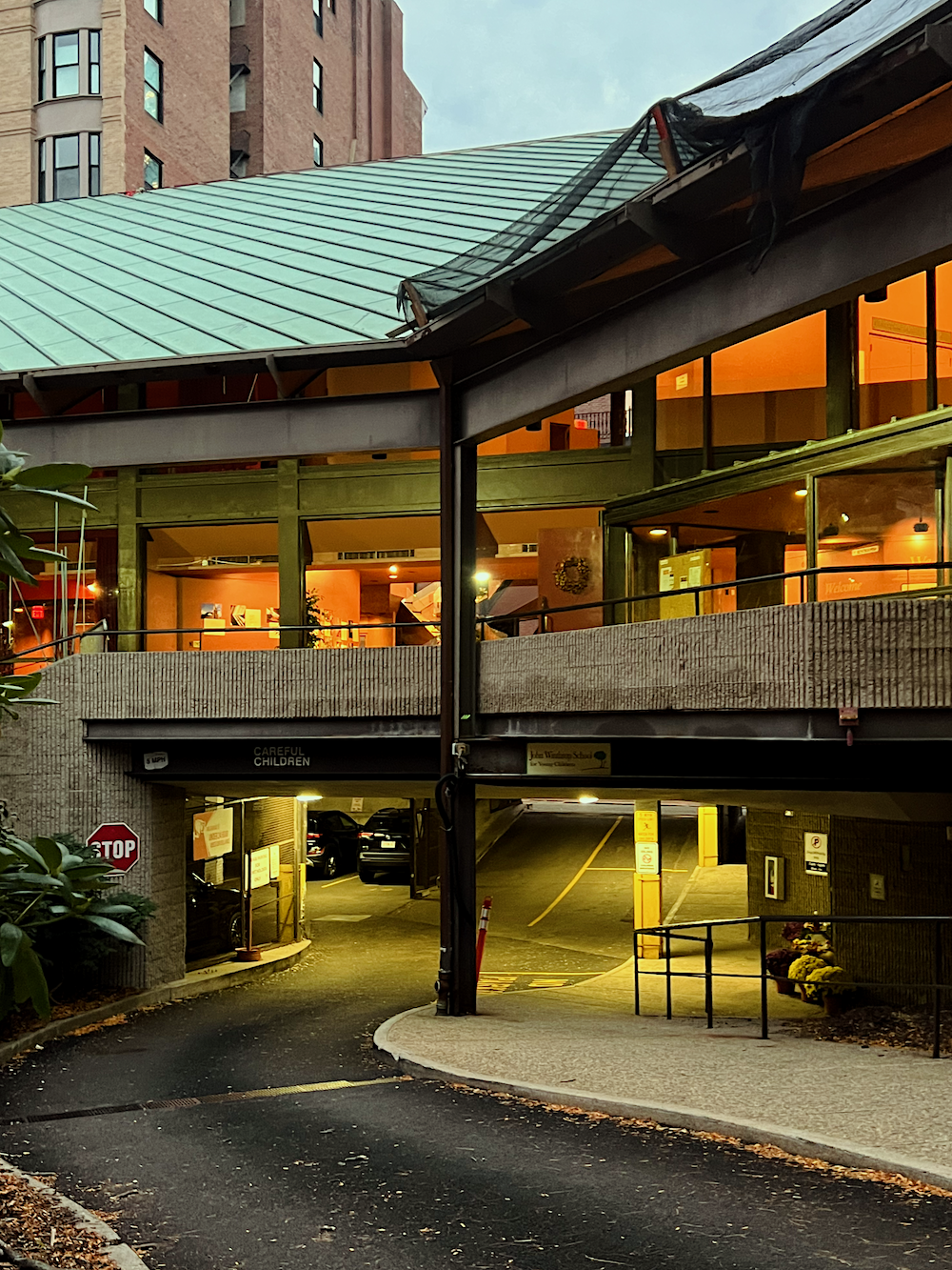
Phew! They’re warning the children to be careful. ;] It looks like the Church is getting ready for Halloween.
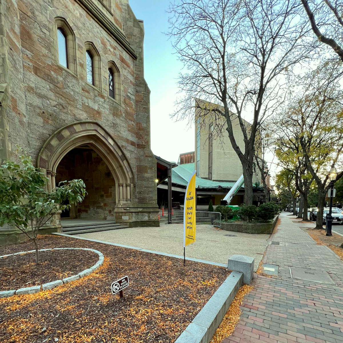
Please notice how seamlessly the new Church fits in with the old building.
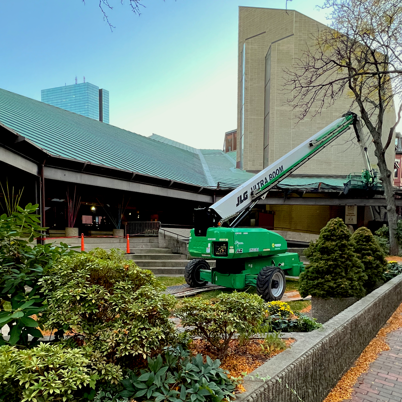
Brilliant, ain’t it?
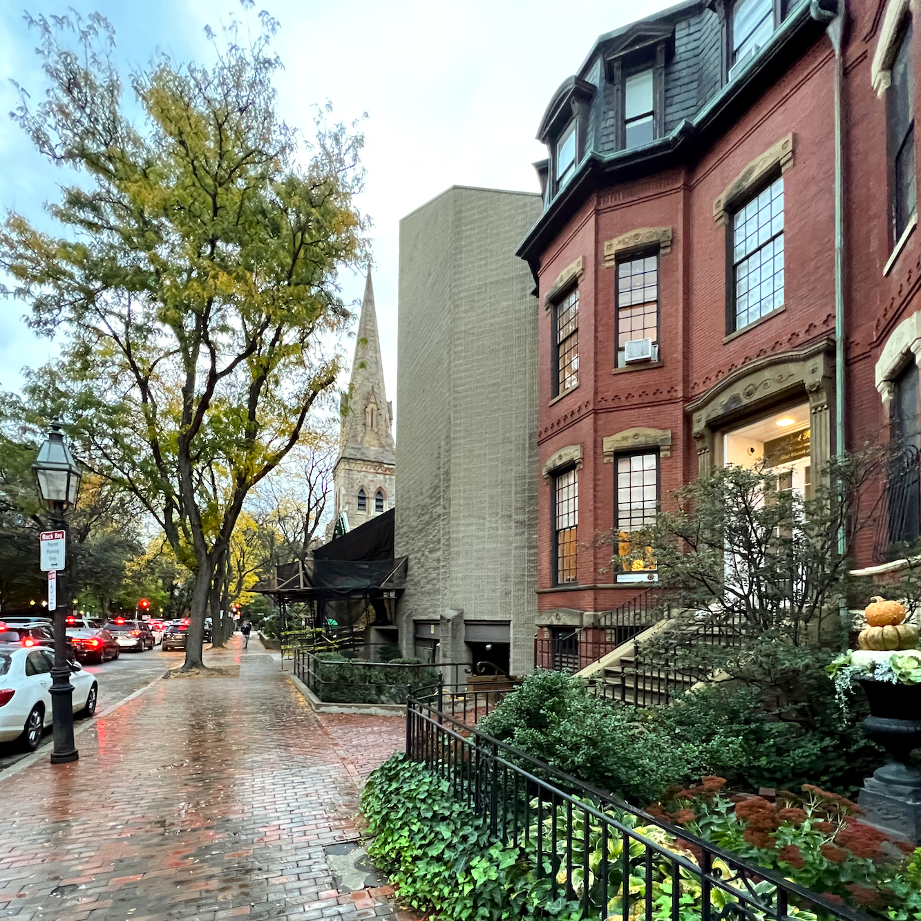
And, also, notice how perfectly it blends in with the rest of the beautiful 19th-century architecture on Marlborough Street.
Aargggghhh!!!
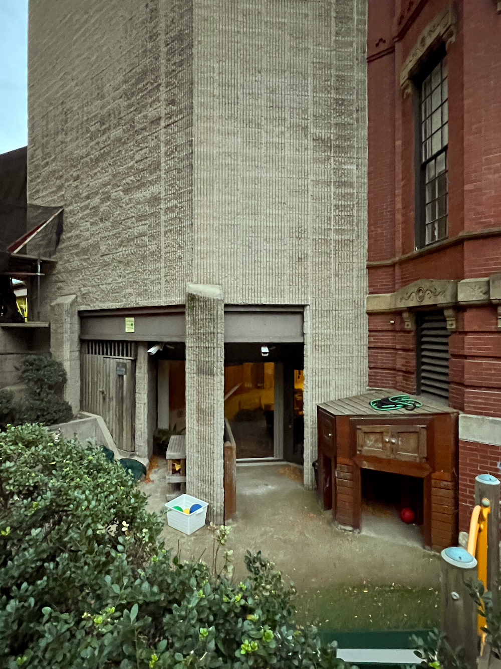
Paul Rudolph’s signature corrugated cardboard exterior.
That’s an awfully cute brick kiddie doghouse. This is viscerally repulsive to me. I can only conclude that this bizarre design was meant to demean and confuse.
There are maximum security prisons more attractive than this place.
Let’s look at the other side of the kiddy concrete playground.
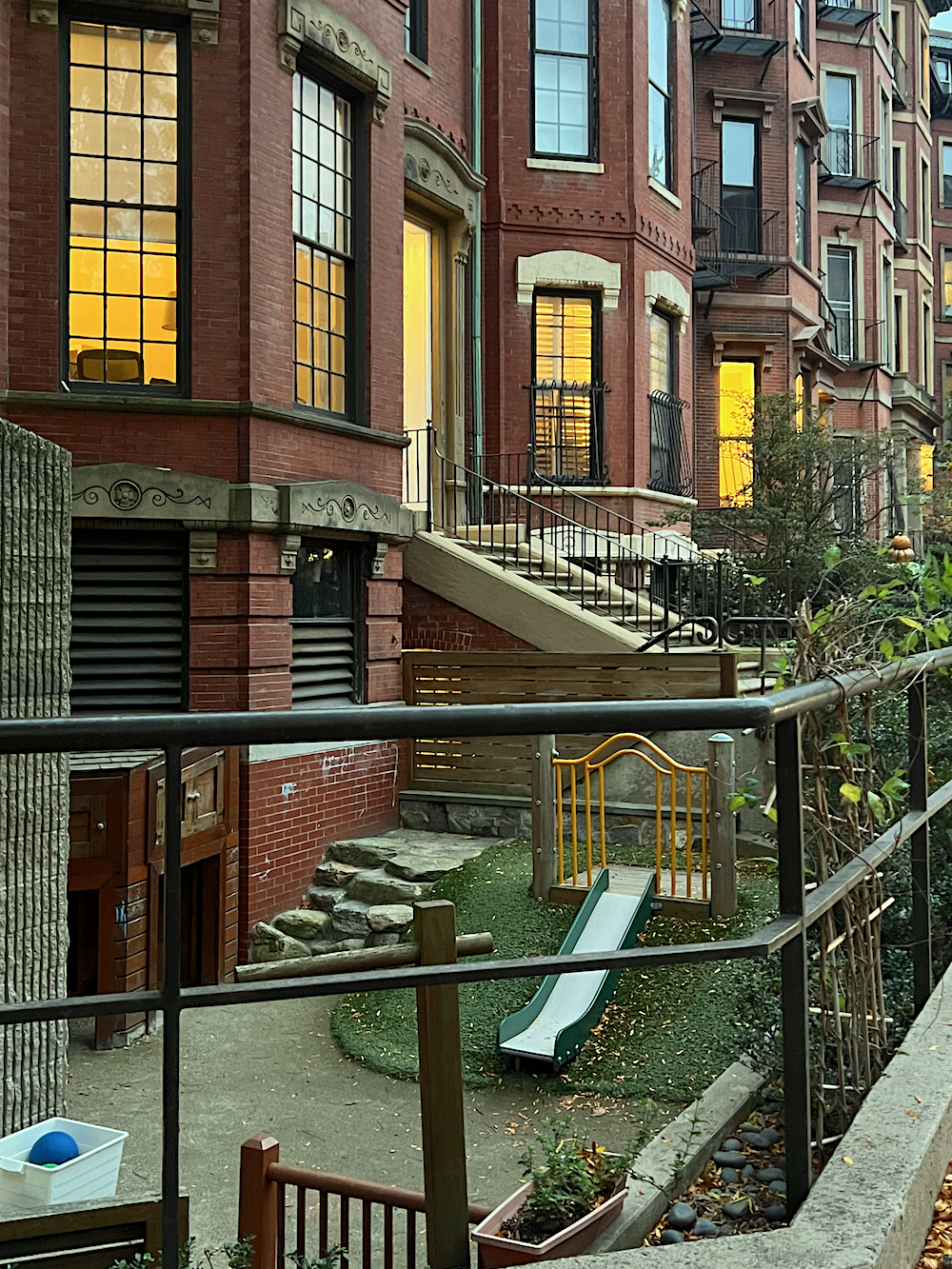
Poor children.
Let’s look at Mr. Rudolph’s obsession with corrugated cardboard on steroids.
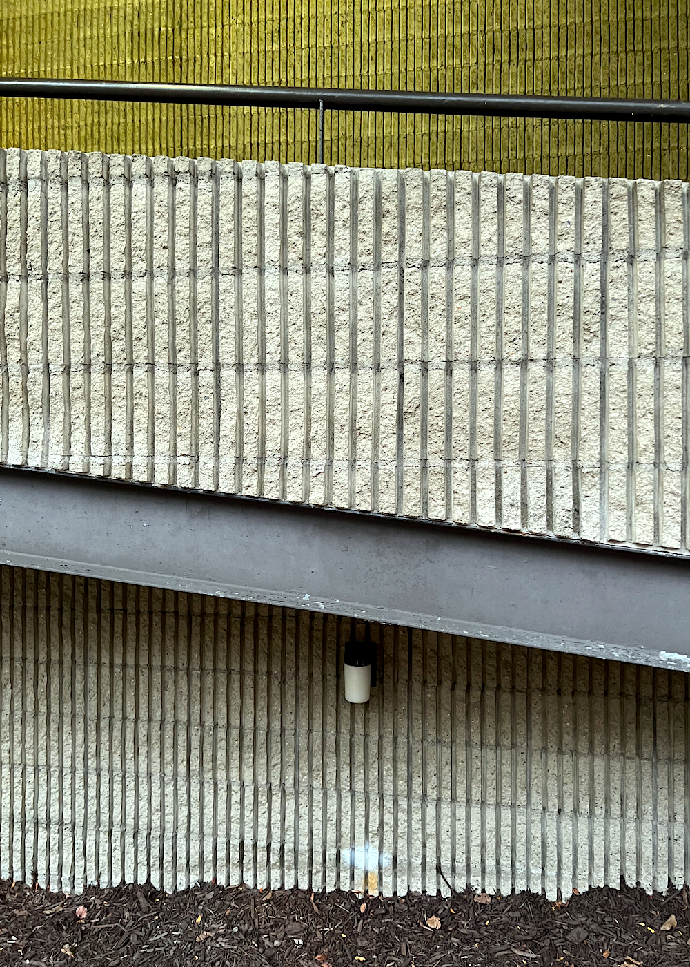
Sadly, on the other side of Berkeley Street, another modern Church has an imposing, albeit brick facade.
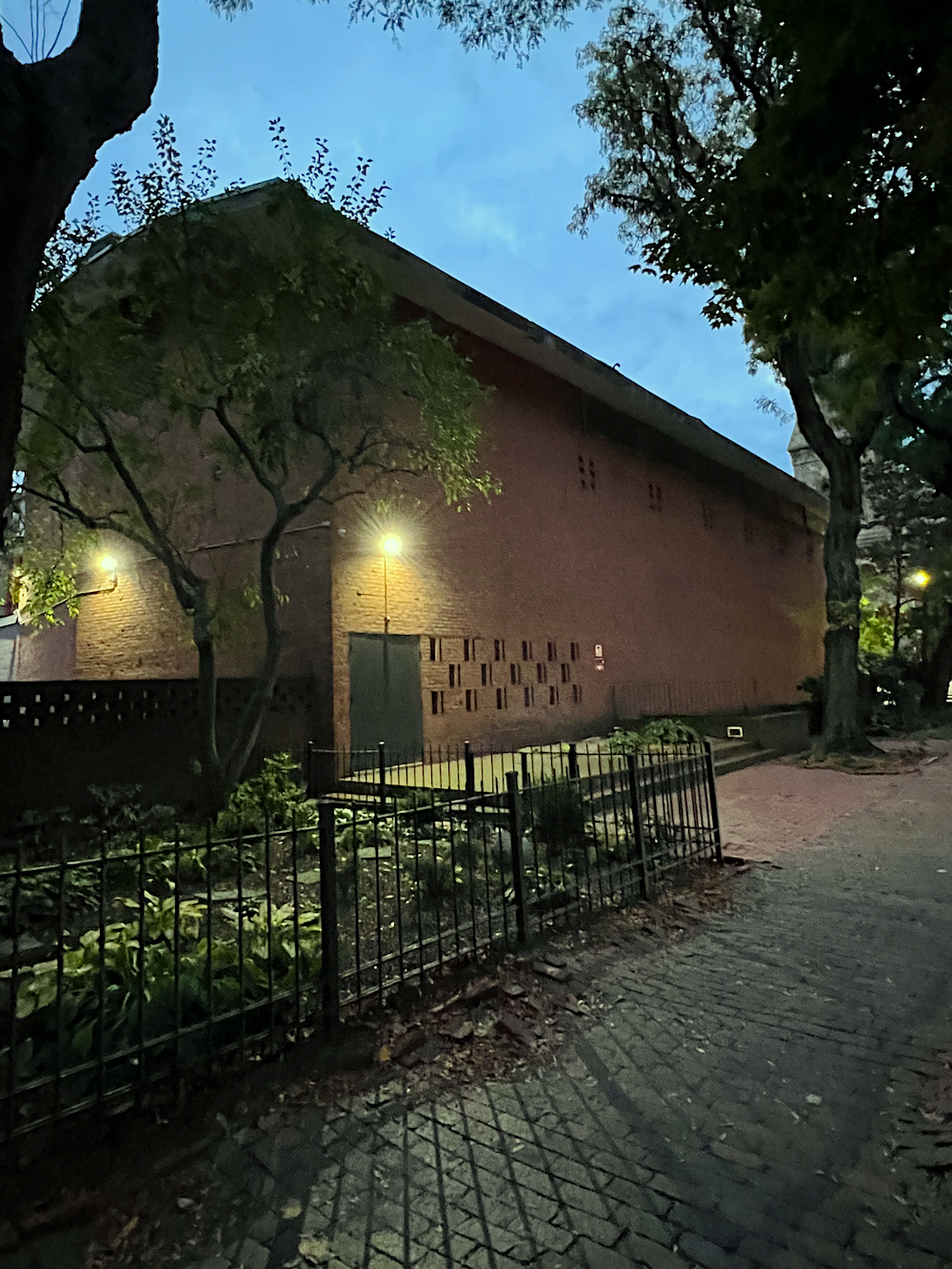
This is the First Lutheran Church of Boston.
I thought churches were supposed to be places to lift folks spiritually.
At best, this looks like a middle school gymnasium.
Okay, that’s enough for today. We will most likely finish this post on Thursday evening.
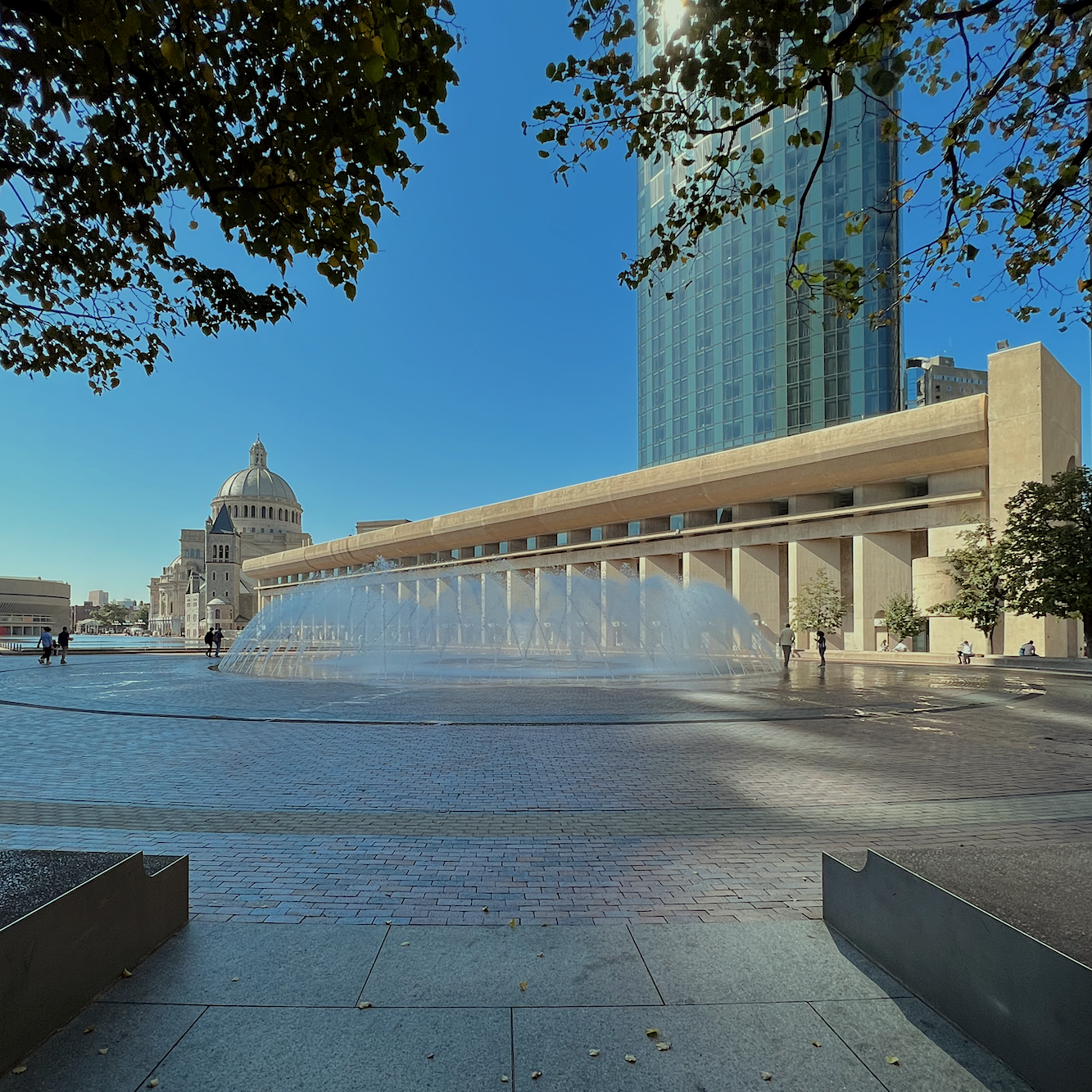
We will begin here. Bostonians, I know you know what this place is. Oh fine. I have the pics ready to go…
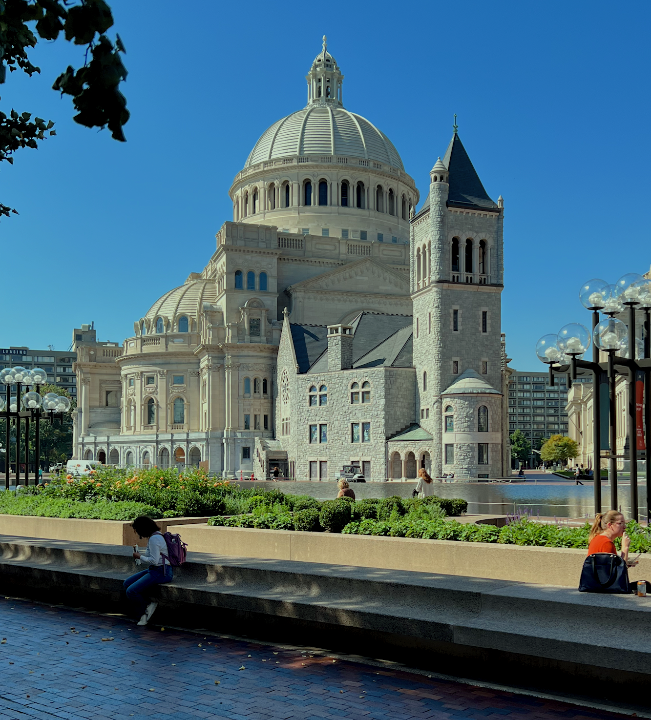
This tasteless bastion of limestone (I think) is part Disneyworld/land, part Capitol/Capital, part Roman/French Cathedral/medieval castle, and part Bellagio Hotel in Las Vegas.
Believe it or not, this is also a church. It’s the Christian Science Center headquarters located in the Fenway section of Boston. It is very close to where my son Cale went to college at New England Conservatory.
I’m not 100% sure, however, I believe the architect was Gomez Addams.;]
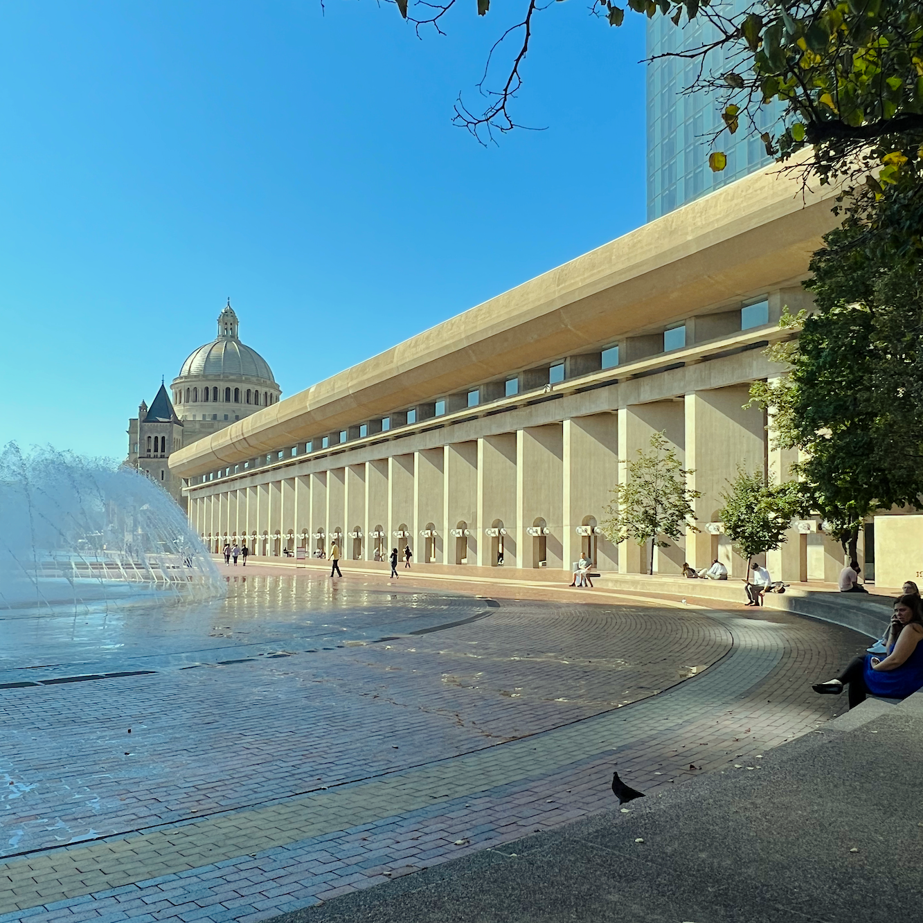
I almost forgot to mention the never-ending Brutalist tail and vast reflecting pool. Why it would be reflecting that grotesque block of unheavenly concrete is a mystery, but a water feature is always a nice thing.
We’re almost done.
However, before I took the images of the Christian Science Center, I went on a Museum of Fine Arts tour. No, not the Sargent exhibit. I’ll do that after I move back to Back Bay.
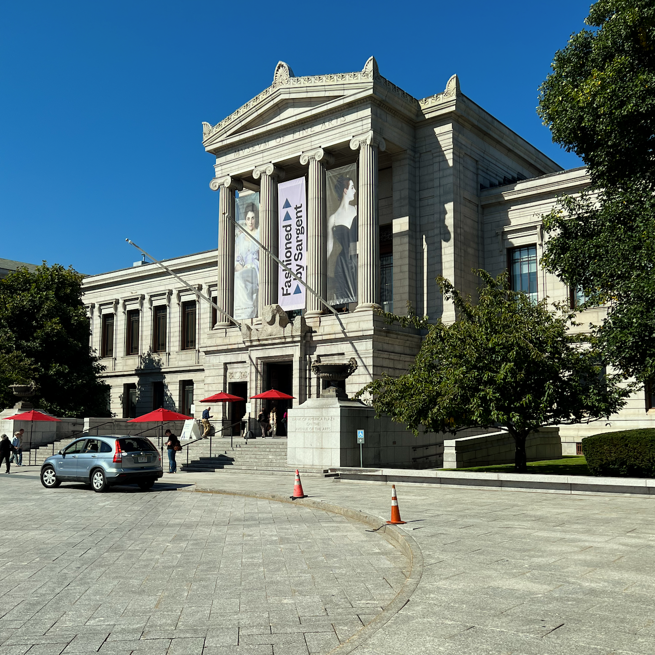
As you can see, it was a bright, cloudless day, which is quite unusual in Boston this year.
Okay, that’s all for now.
xo,

Please check out the recently updated HOT SALES!
Also, please check out the Holiday Shop for 2023 that’s full of great ideas for holiday decor and gift guides!
There is now an Amazon link on my home page and below. Thank you for the suggestion!
Please note that I have decided not to create a membership site. However, this website is very expensive to run. To provide this content, I rely on you, the kind readers of my blog, to use my affiliate links whenever possible for items you need and want. There is no extra charge to you. The vendor you’re purchasing from pays me a small commission.
To facilitate this, some readers have asked me to put
A link to Amazon.com is on my home page.
Please click the link before items go into your shopping cart. Some people save their purchases in their “save for later folder.” Then, if you remember, please come back and click my Amazon link, and then you’re free to place your orders. While most vendor links have a cookie that lasts a while, Amazon’s cookies only last up to 24 hours.
Thank you so much!
I very much appreciate your help and support!


