Be inspired by these new color trends for 2024 from Maison et Objet and the Paris Design Week
I’m back from an interesting visit to the September edition of Paris Maison et Objet and Paris Design Week. Paris is always a great source for all those who are looking for inspiration on colors and decoration, as the French have a special taste regarding all things decorating. Plus, this edition of Maison et Objet was particularly rich in terms of brands and participants, with many interesting news, including new areas such as for example the well-being one.
In this post, I’m sharing with you some new colors I spotted during my visit. More than on single colors, I’m focusing in color schemes and new effects this time.
If you are interested in finding single colors, you can also refer to this color report from Paris I did last year this time. As I predicted last year, in fact, this year was still a lot about maximalism and bold colors – such as oranges, reds, sapphire blues and so on. So that post I did last year is still very current.
In fact, while it’s quite easy to find out what is trending now, what is less obvious is to spot emerging trends that may be not so common now but will be in the future. If you are interested to dive more into trend forecasting and have more in-depth updates, you can find more in my trend platform here.
Color Trends 2024 from Paris
color trend 01 / Iridescent & Gradients
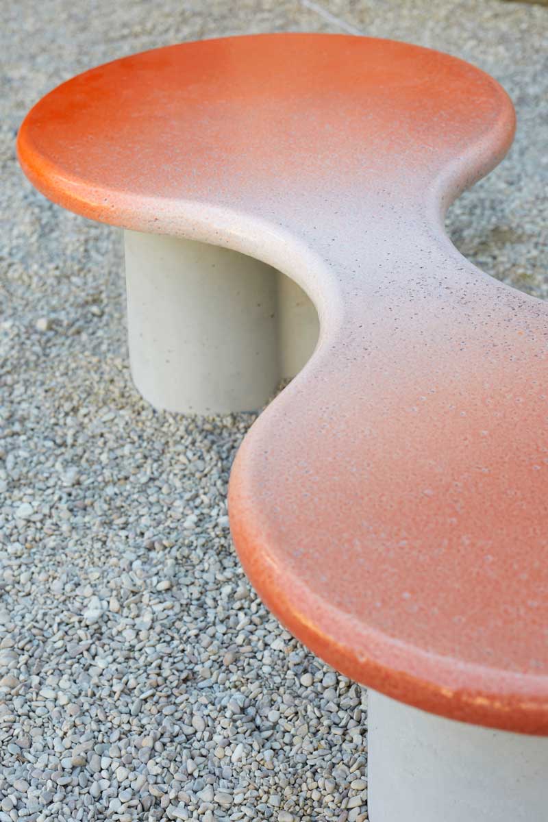
I’m starting to notice more and more dynamic color effects coming in interiors and design. That’s a consequence of the phygital macro trend ( discover more on TRENDBARK issue 01/23 ) but also of lots of new materials and color innovations coming in our industry. Lots of transparencies too and colourful glass – a very different and quite opposite trend than the wabi sabi aesthetic we have been used to in the last years ( that is still very popular, btw).

Polspotten ©AETHION
Uchronia

Uchronia

Uchronia
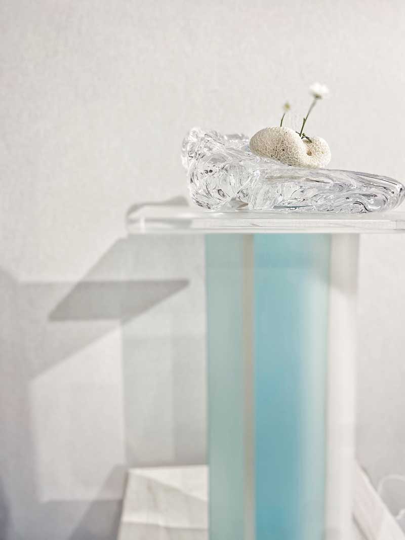
Studio Yula

Peclers Paris ©AETHION
color trend 02 / Pastels & Bold
If you have been listening to my free trend webinar last October, you will remember that one of the 4 trends I shared there was called “digital pastels“. At that time it was forward-looking as it was all about dopamine colors and pastels looked a bit out of trend. But I could see them coming back a lot in Paris this year – that was about softer colors, often paired with bold ones. The dopamine trend is still here but I think it will be definitely become softer – a very dreamy and surrealist kind of mood, still playful but not as strong as what we have seen in fashion and interiors since 2020.
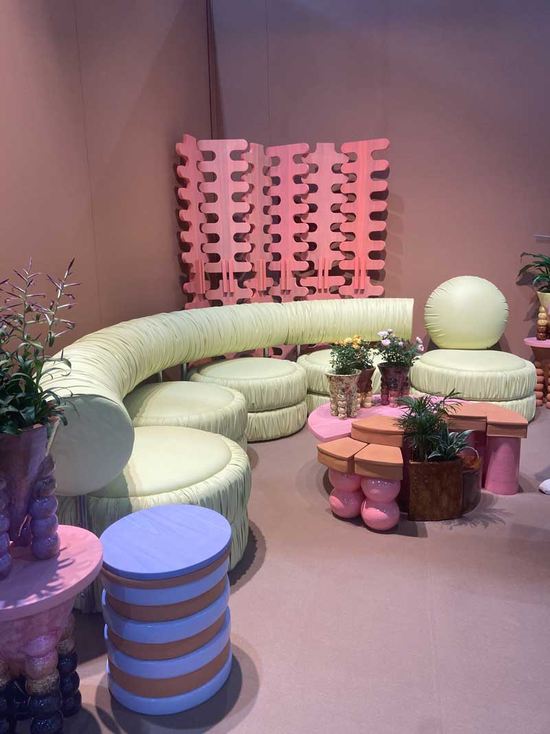
Masquespacio

Bitossi Home

Muller Van Severen ©AETHION
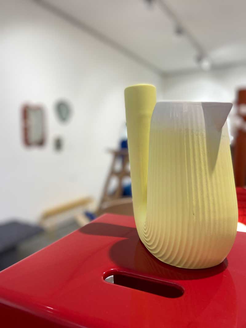

Muller Van Severen
color trend 03 / Red & Pink
Red and pink is one of those color combinations that is not so often recommended, because it may not be balanced and it’s quite difficult to be used. But – as it always happens when matching colors- it’s all about the kind of red and the kind of pink you choose. I spotted red+pink it in Paris many different times and in many different context – all of them working great.
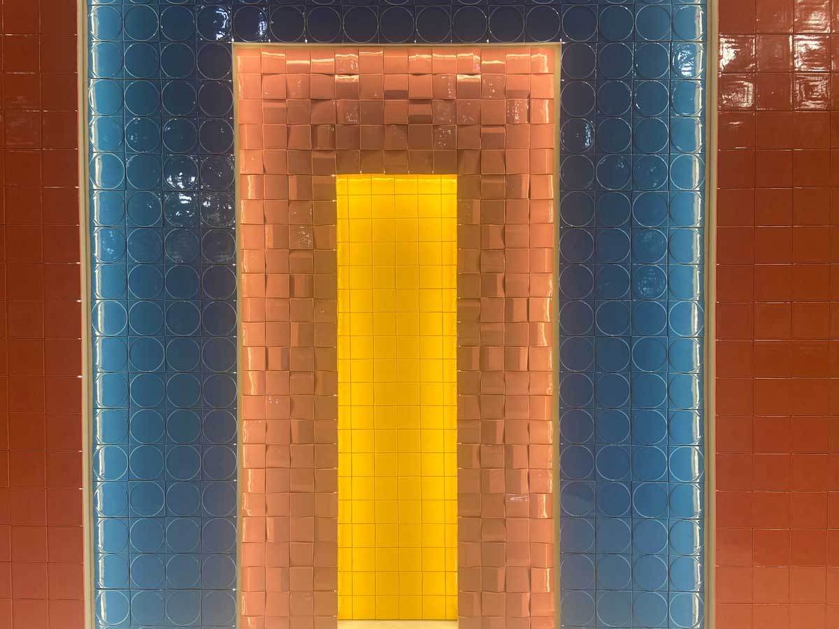
Barrio tiles

Perclers Paris ©AETHION

India Madhavi
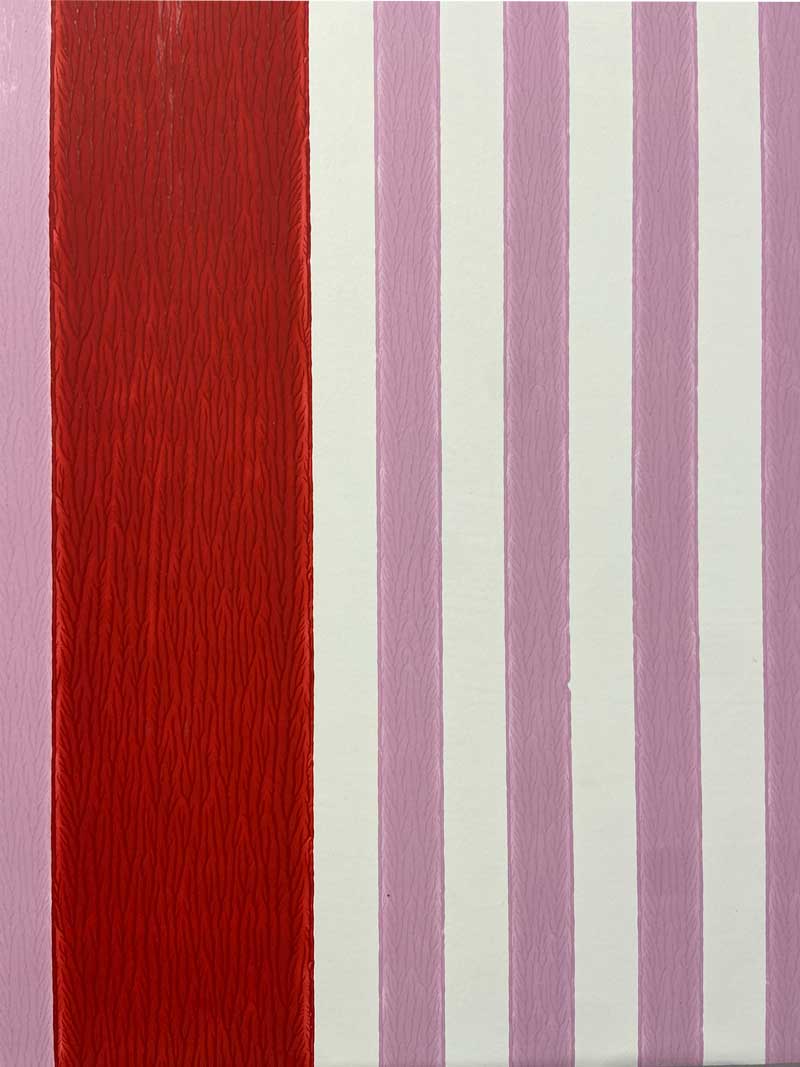
farrow & Ball x Christopher John Rogers
color trend 04 / High Contrast color schemes
One of the richest exhibitions in terms of colors and inspirations was for sure the Pattern Factory by Elizabeth Leriche. There, it was a lot about color schemes with high contrast: black and white, bold orange / blues / greens, rich colors and of course patterns. The reference is towards the end of the Seventies and the Eighties, a decade where colors definitely got stronger and also took the distances from the earthy and nature-inspired hues of the 70s.

Elizabeth Leriche ©AETHION

Elizabeth Leriche ©AETHION


Elizabeth Leriche ©AETHION
color trend 05 / viridian & petrol
BTW – If I had to choose one color that was my favorite from the Paris Design Week + fair, I would choose a color somewhere in-between between green and teal. Petrol blue – viridian, make me think about the ocean and at the same time I think are so elegant and refined when used in interiors.
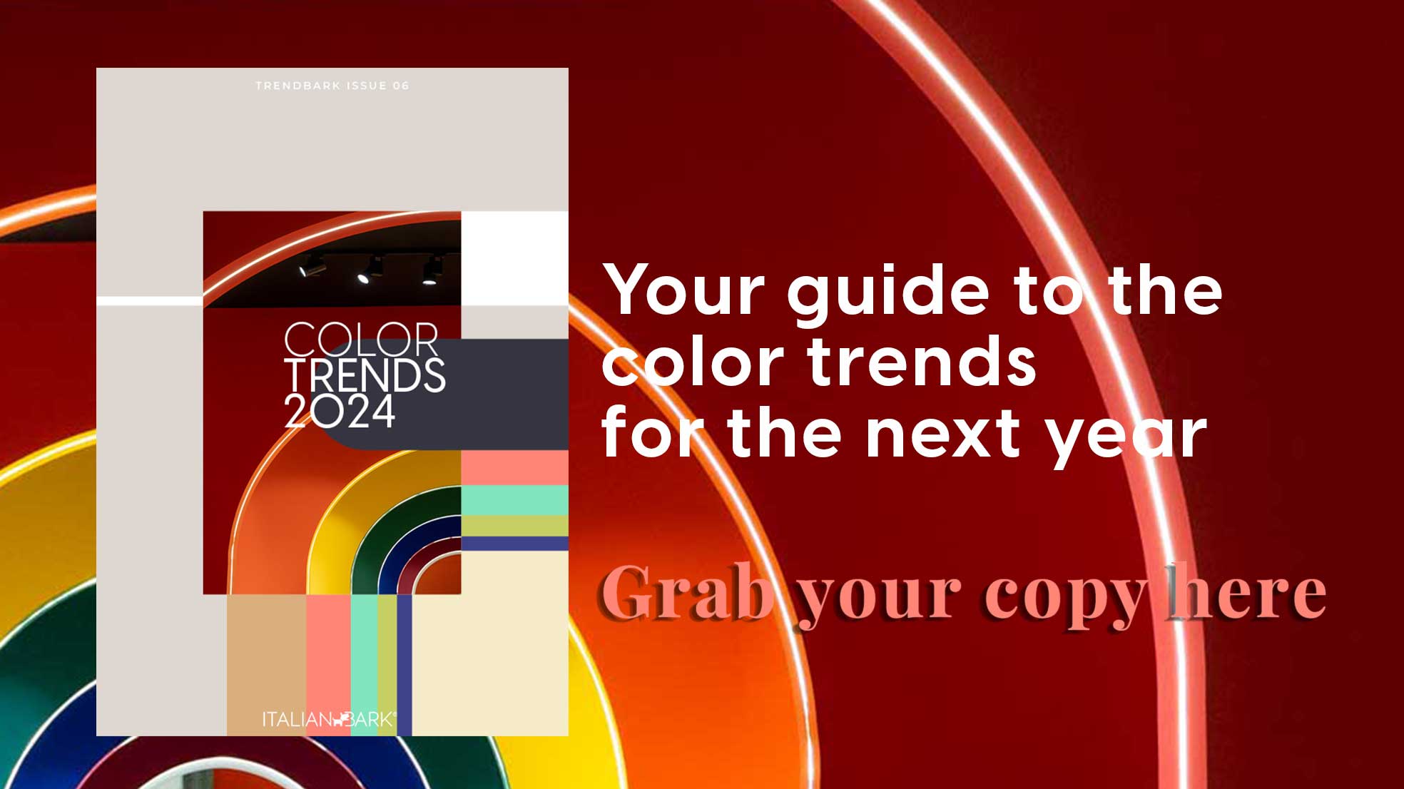
For this and other color trends for 2024 – I recommend you to have a look at this post and at my Trendbook | COLOR TRENDS 2024.


Sebastien Cox©AETHION


