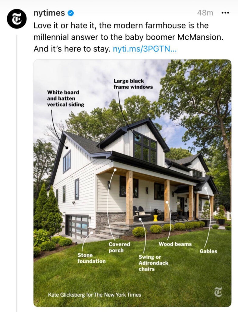
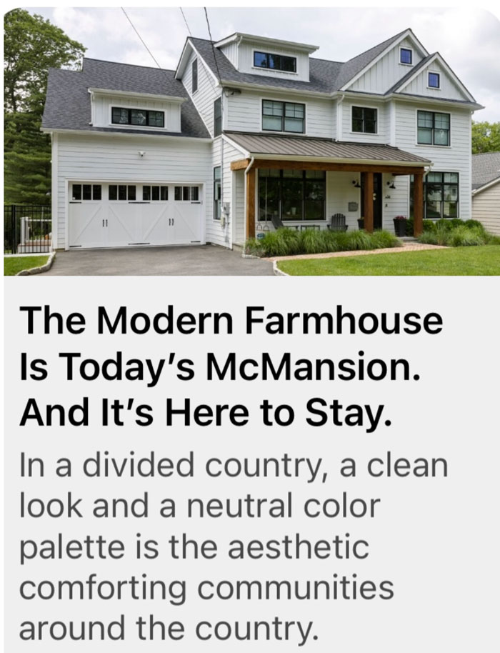
What makes the black and white Modern Farmhouse so sticky? That’s the question being asked in this article that appeared last week in The New York Times. I’m unpacking the psychology behind the black and white trend and why it has more traction than any colour trend in history.
Wondering what a McMansion is? This is the best site to find out.
In my 25 years as a colour designer, living, breathing and eating colour trends I have–yes I’m a broken record– never seen anything like this.
But First, a brief history of recent colour trends
I started my colour career in my 30s during the sage green/pink beige 90s trend. And I was right there at the start of the espresso brown trend in the early 2000s. I was looking for pale blue and brown fabrics (remember how that was the first combination tip toeing into colour?) for clients who wanted blue accents before it was even available.
Then the grey trend arrived on the scene in 2009 just when I started writing this blog and well, some people still think grey is hip and trending. But you, reading this blog, and especially my longtime readers? YOU know better.
Read more: What EVERYONE should Know About Grey
White walls were the newest thing and then Black showed up
In 2016, I went to Maison & Objet in Paris and declared black to be the new grey because it was everywhere and little did I know how intense this trend would become.
Social media helped this phenomenon along. Plus the fact that manufacturers now have technology that allows them to produce so much more black in items that were previously not available in this darkest of colours the last time black was trending (in the 80s). Think hardware, plumbing and lighting.
What you need to know about choosing black for your house
People are seduced by the high contrast. But because black is the darkest colour, especially surrounded by white, it draws the eye where ever it’s installed, this is also the reason it should be used sparingly and with restraint.
Because no one needs to tell you when you’ve hit the tipping point with too much black, you can feel it.
Read more: The Perils of Decorating with Too Much Black
Black and white was timeless until this trend came along
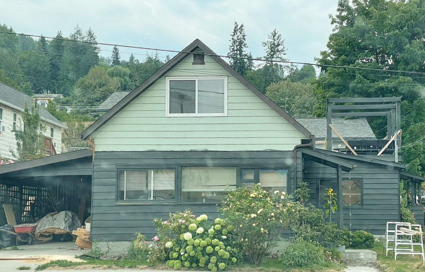
On one of our trips last summer I snapped this photo of a green cottage going black. I’m sorry but this house has no business being a modern shade of black and I was sad to see it happening.
I also keep receiving emails and messages from followers who are out to convince me that a white exterior is timeless, and I’m here to tell you that in the past, it absolutely was a timeless colour. Until this trend came along and ruined the timeless white house for the next 15-20 years.
In fact my sister lives in a house with white vinyl siding from the 80s. Does this mean she is running out to replace her white vinyl siding with something else? No, but it still looks trendy whether we like it or not.
In other word, in the context of this trend and for the foreseeable future, black and white interiors and exteriors especially, are going to look trendy even if they are technically classic.
I saw a video where a parent was taping their 8 year old who was playing basketball at the school gym. And you guessed it, the walls were black. The only saving grace was the warm wood floors but likely those warm floors are probably being replaced by grey in new schools that are currently being built.
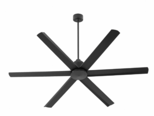
Another video featured a 5 year old chirping “Mom, are you going to paint it black?” as the home renovator gleefully removed a dated ceiling fan.
This was all presented in the spirit of, “Of course I’m painting it black because I’m so brilliant!”
And that takes me to my next point.
The real psychology of the black and white trend
1. The first reason why black is so popular
I believe this answer why people choose black, articulated by my Director of eDesign Tricia Firmaniuk, says it best:
‘The consumer feels empowered because the answer seems simple, they have popular permission (it’s all over social media ad nauseam) and they get to be bold at the same time as they get to be conservative.’
Every one of us is highly influenced by trends (even if you think you’re not, I promise, you are). And suddenly black is not only the popular choice for everything from windows to plumbing fixtures, it has become the default choice.
It looks new and cool. And it goes with everything right? (Um, no.)
And now that it seems to be the only choice anyone wants, black is the only finish option available off-the-shelf for everything from lock sets to faucets at the big box stores.
But the biggest reasons why black and white is so big is, it’s the very definition of simplicity.
When you think about it, there are many different undertones and shades of beige and grey not to mention each of these undertones can be either light or dark, but black. . .well it’s just black isn’t it?
Get yours here
Makes the idea of choosing a colour to finally get that paint job done, that’s been lurking for years, so easy and off the task list.
One of the talented colour designers from my eDesign department sent me this quote she read after we discussed it in our team meeting:
So yes, black and white seems like the BOLD option. (But let’s not forget there is an endless universe of COLOURS to decorate with that are neither drab, nor too stark and predicable.)
2. Black and White perfectly represents our polarized culture
The cultural discourse, as we all know, has become increasingly polarized with the growth of social media and the influence those algorithms have on what we interact with socially and politically.
And then during the pandemic, stances on how to react quickly became starkly black or white. It was so divisive, people set up camp with their lines of thought and stayed there. I’m certainly guilty of it.
We’re suddenly cancelled if we’re bad, so we’d better be good, sick or well, rich or poor, right or left. Moral grey areas are gone, as is the middle. Not to mention colour. The world is now literally living in a black or white zone.
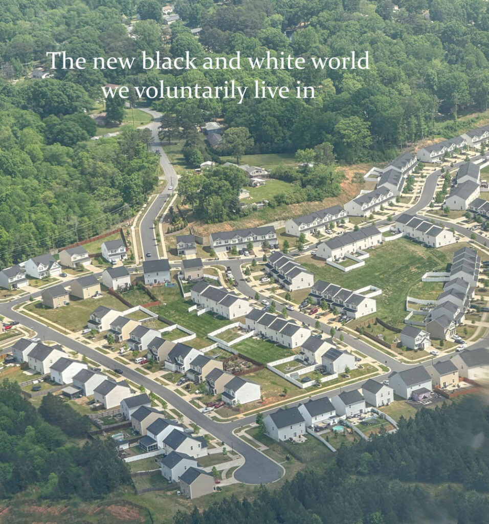
And our neighbourhoods are increasingly a visual reflection of that.
3. White is clean and sanitary
During and since the pandemic we’ve been obsessed with sanitizing everything. So it’s no coincidence that when white came along, it seemed so fresh and new, and the answer for all things old and dated.
White is clean and sanitary, it symbolized hope in dark times, it’s no wonder we wanted to paint everything white.
And cleanliness is more of a psychological value than an aesthetic one. In other words, the appeal of the ‘clean’ look of the black and white trend trumps the potential beauty of more nuanced colour options.
And, like it or not, a stark white and black house will always be associated with the pandemic because that’s when the trend really started to gain peak traction.
We’re already seeing a return to colour, pattern and even maximalism as a direct reaction to the stark and generic, faux bucolic vibe of the modern farmhouse look.
How much black is too much?
For the record, I do NOT have a ‘deep hatred of black’ as one of my followers suggested the other day on Instagram. I am simply here to be the beacon of good taste so you don’t overdose on the deepest, darkest colour on the planet.
I also don’t want the investments you’re making in your home to make your house LESS valuable over time. You never want to be installing finishes that are on the tail end of any trend cycle unless maybe you’re flipping it tomorrow.
There’s a reason why the expression “Every room needs a hit of black” is a thing. A hit is a little not a lot, a little not an overdose. I think a good question for if you’ve hit the black tipping point is this
“Is BLACK the first thing you see when you walk into a room?”
If it is, it’s likely you’ve got too much.
And I do admit that I have developed an allergy to adding black in my own home. Since I’ve moved into this house, every time I have made a decorating decision that’s black it’s because I had a designer friend gently say “Maria, x should be black”. Like the floors in my powder room, the treads of my staircase or a coffee table I’m adding to the living room.
The best thing about the black and white trend
The good news is this, the modern farmhouse exterior is clean. It’s not filled with the blotchy, earthy stone of the brown trend where we were forced to choose a neutral whether you wanted one or not. It can in fact easily be painted a fabulous colour because of the nature of the design.
It’s why I added a colour module to my Masterclass this year so that you could make a choice that will be different from the black and white street you’re on.
What do you think? Is the black and white trend psychologically driven? Are you ready to see it end? Please keep the conversation going and leave your thoughts in the comments. I love to hear from you!
Related posts:
Ask Maria: When is Black Timeless? And 4 Design Traps to Avoid
4th Rule of Design; Trendy Equals Temporary
How the Black Trend Just Got Even Worse!

