Tamaghna and Tania had a very simple concept in mind for their 3BHK apartment in Navi Mumbai: it should be a happy place, somewhere they would want to be all the time! Other than this short and sweet brief, they gave HomeLane designer Vrushali Vatkar carte blanche when it came to the design and execution of the home interior.

And with this simple ideology in mind, Vrushali has thoughtfully crafted a home that emphasizes clean lines, with pops of colour and nuanced patterns adding vibrancy to a rich off-white canvas. Every inch of space in the Bhattacharyas’ home has been carefully designed to incorporate practicality and align with their personalities.
The no-nonsense visual narrative blends contemporary design with tactile elements, bold colour-blocked finishes and delicate patterns to create a unique vocabulary that perfectly resonates with the clients’ needs. Tight corners have been rendered airy and practical, with clever space planning in focus at all times.
Ready to take a look at their lovely home? Read on!
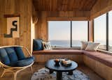
Earthy shades of blue, beige and white have been implemented in the living room colour palette, ushering in the colours of nature into the home. A wooden swing seat faces the balcony, capturing spectacular views of the Mumbai skyline, while the plush beige-coloured sofas are custom-made for comfortable TV viewing. The sleek entertainment unit is designed with a tall display case alongside to hold memorabilia and collectables.

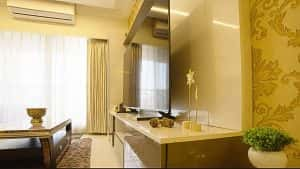
Pretty metallic wallpaper in burnished gold elevates the aesthetics of the dining room, while the marble-topped dining table continues the luxe visual dialogue. A stunning modern crystal chandelier effortlessly draws the eye upwards, exuding an opulent vibe.
You can never have too much storage in your home, and Vrushali has eked out every bit of cabinet space wherever possible across the apartment. Leading off from the dining space, a display cabinet with an easy mix of open shelves and closed cabinets offers much-needed space to showcase the family’s book collection and stow away unsightly clutter.

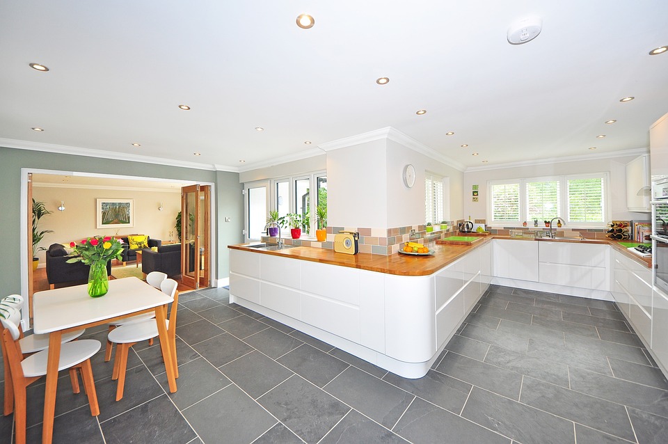
The compact L-shaped kitchen is done up in a striking combination of electric blue and dove grey. Two rows of upper cabinets squeeze out extra storage space, allowing the convenience of stowing away items that are infrequently used. The striking backsplash in patterned Moroccan tiles ties the colours together, creating a lovely graphic backdrop to the high-gloss cabinetry.

Thoughtfully designed lighting layers enhance the functionality as well as the ambience, casting light on meal prep and cooking areas, and ensuring optimal visibility for culinary endeavours. Ambient spot lights in the false ceiling cast a warm and inviting glow, creating a welcoming atmosphere for gatherings and mealtime.

Sophisticated and stylish, the glass sliding shutters in the master bedroom wardrobe are painted in metallic grey and lend contemporary flair. The sleek design and reflective surface of the glass create a sense of spaciousness, lightening and brightening the room.

Vrushali made sure that she took care of the couple’s every need; this compact home office being the perfect case in point! Deep violet pairs with silken cream in the storage cabinets and desk space in the apartment’s second bedroom. Extending out from the wardrobe, the practical desk is designed to offer easily accessible storage drawers and cabinets, with smart wire management systems for a clutter-free workspace.

The wardrobe unit in the third bedroom incorporates a dressing table, infusing a practical element into the compact square footage of the space. Glossy white laminate with a self-print adds a subtle touch of pattern to the otherwise plain façade. The interior spaces of the wardrobe are designed to maximise convenience, with a loft that adds extra storage for suitcases and boxes – very valuable in Mumbai’s apartments!
Along the second wall of the room and adjacent to the en suite bathroom, a fitted desk with a TV unit makes the best use of available space. Open and closed shelves above the desk offer ample storage for work essentials.
Summing up the reasons why they enjoyed the HomeLane experience, Tamaghna says, “I was always unsure of how I would communicate with the carpenter or the electrician. I thought that I may say something, but they would understand something else – and I would have to come and offer my suggestions. I just don’t have the expertise to understand designs or to make them understand my needs, so this would never have worked!” With HomeLane by their side, everything was taken care of by the team and communication was seamless.

Something else that they applauded was the transparency of the entire process. ”One common challenge that everyone faces when doing up their interiors, is that the budget always gets exceeded. We might want something, and end up getting something quite different!” This was not the case with HomeLane. The couple were well prepared to pay whatever was communicated at the outset. “And whatever we had agreed upon, the same amount is what we had to pay!”

Right from the very beginning, Tamaghna was very clear about the fact that he would not be able to devote much time to the supervision of their home interior, and this was where he found the HomeLane team delivered on their assurance of quality. As he is quick to point out, “(In today’s world…) it’s really not easy to give so much time! If someone can take care of the work with focus, with dedication and quality, I think life is sorted!”
Like Tamaghna and Tania, would you like to give your home interiors the HomeLane edge? Visit our website and set up a call with our design experts today.


